 All-in-One Solution
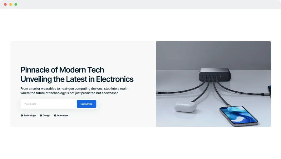
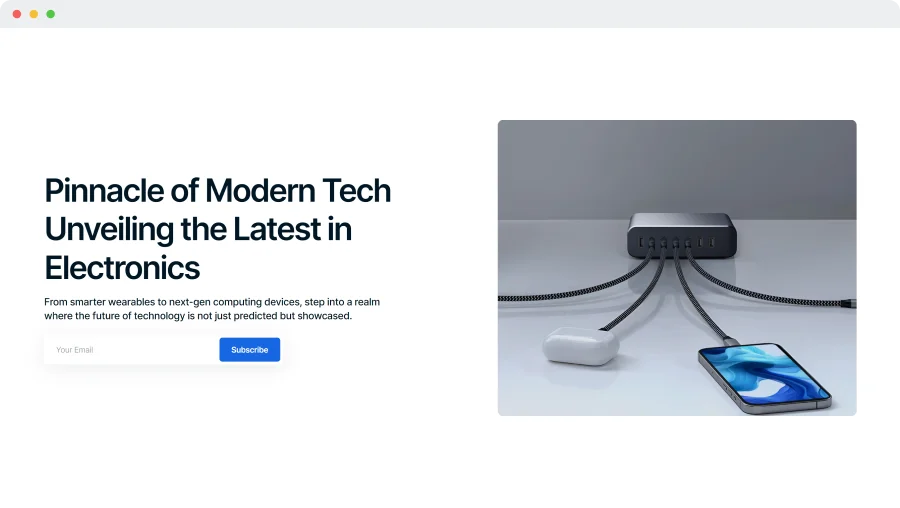
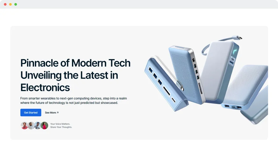
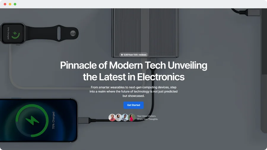
First Multi-Use Shopify Theme with Ultimate Feature Set
Versatile Shopify theme for modern businesses, featuring 125+ customizable sections, advanced filtering, quick product views, and a responsive design—built for high-performance, sales-driven stores.
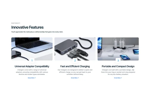
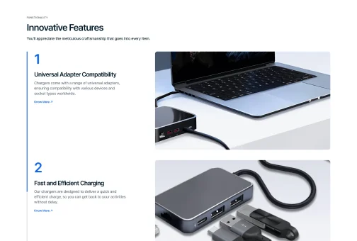
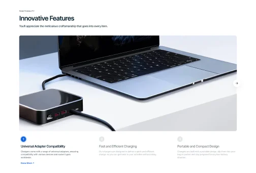
Universal Design
Build the perfect store with our diverse selection of sections, designed to fit any business model or product range.
Engaging Animations
Capture and hold attention through sleek animations and bold headings, making your site memorable and distinct.
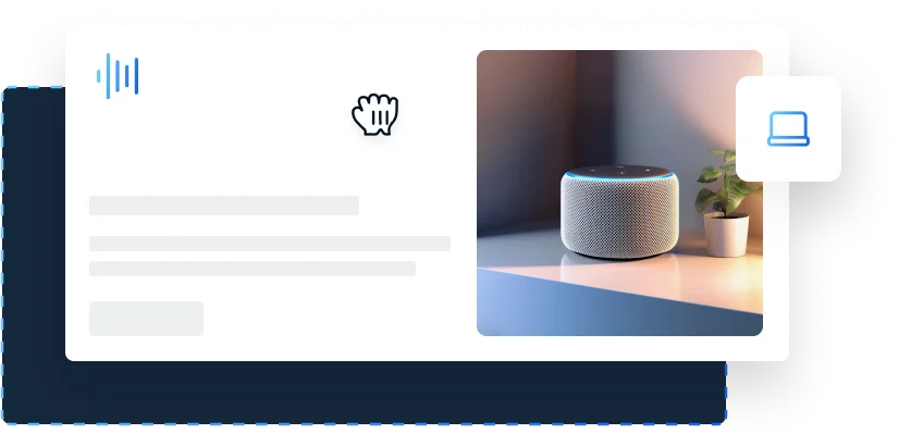
Sales-Driven Tools
Boost your brand with unique selling tools, including digital product showcases and compelling case studies.
Visual Distinction
Enhance your site’s appeal with vibrant elements like gradient icons, optimizing the visual design and user experience.
Pre-Built Starter Sites
Five Ready-to-Use Presets
Access five unique, pre-designed presets that perfectly balance style and functionality to suit any industry and audience.
 Lifetime Access
One-Time Payment. Zero Ongoing Fees
Get five customizable presets, regular updates, and lifetime support with a single purchase. No additional costs or recurring charges—just everything you need in one package.
Unlimited Flexibility
125+ Section Combinations
Mix and match section variations to build a unique eCommerce store that perfectly showcases your products, no matter the industry.
Static Image Background
Side-Aligned Hero with Background
Side-Aligned Hero
Multi-Feature Static Hero
Full-Screen Image Display
Distinctive Icons
Cards with Descriptions
Cards in Columns
Carousel with Background
Carousel without Background
Cards with Large Images
Carousel with Images
Carousel with Quotes
Cards with Small Images
Animated
Bordered Rows
Transperent Background Rows
Bordered Rows
Transparent Columns
Bordered Columns
Overlay Columns
Solid Background Columns
Carousel with Images
Clickable Logotypes
Carousel with Image Background
Vertical Layout
Horizontal Layout
Scroll Layout
Full-Width Image
Static Display
Horizontal Slider
Vertical Slider
Horizontal
Vertical
Background
Slider with Bold Background
Slider with Transparent Background
Slider with Ovelay
Grid View with Overlay
Grid View with Bold Background
Grid View with Transparent Background
Full Screen Overlay
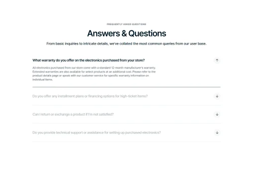
Interactive Hover FAQ
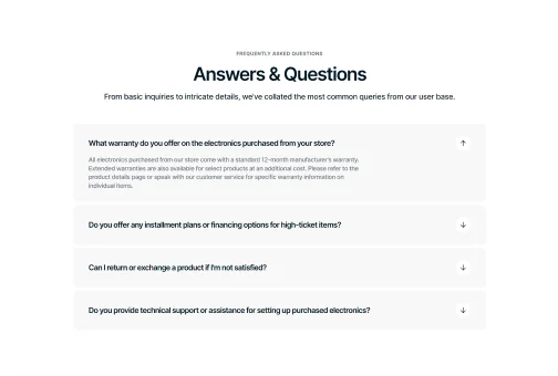
Distinctive Accordion FAQ

Content Focus Layout
Feature Highlight Layout
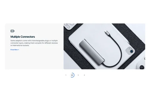
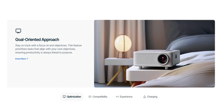
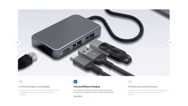
Image with Description (Numbered)
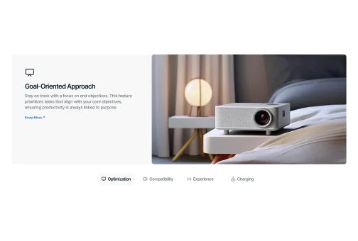
Image with Description (Icons with Texts)
Image with Description (Active Tab Borders)
Full-Width Image
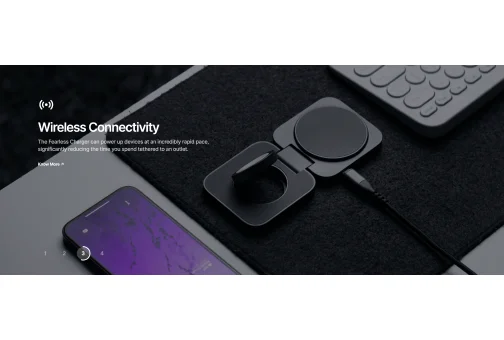
Image with Text Overlay (Numbered)
Image with Text Overlay (Icons with Texts)
Image with Text Overlay (Active Tab Borders)
Image with Text Overlay (Dots)
Large Left Grid
Horizontal Split Grid
Tall Left Trio Grid
Balanced Quad Grid
Layered Step Grid
Compact (1 column per row)
Compact (2 columns per row)
Compact (3 columns per row)
Portrait
Vertical
Landscape
Square
Pricing Table
Markers
Compare
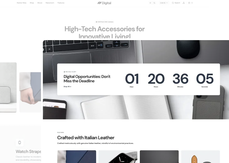
Basic Countdown Timer with Shadow
Basic Countdown Timer without Shadow

Full-Backdrop Countdown
Container Embedded Video
Full Screen Video
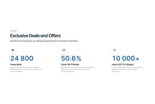
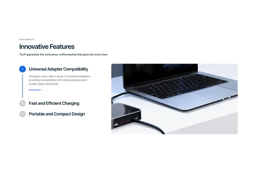
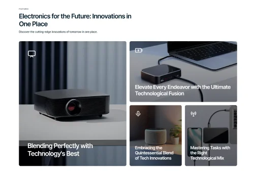
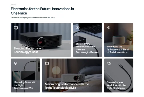
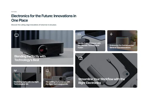
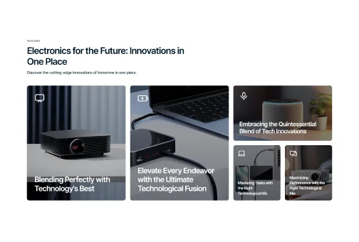
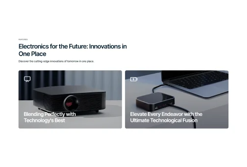
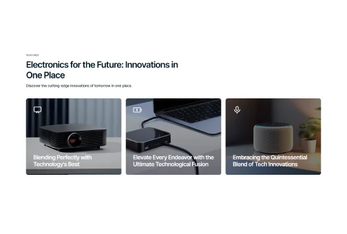
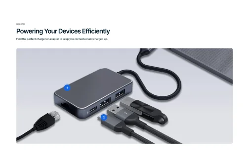
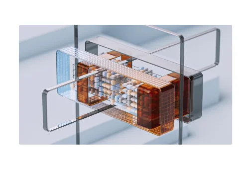
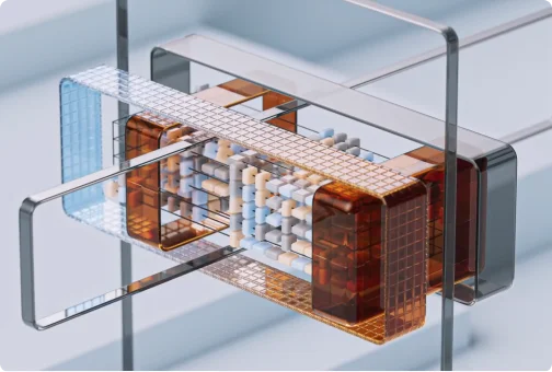
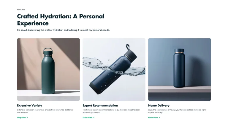
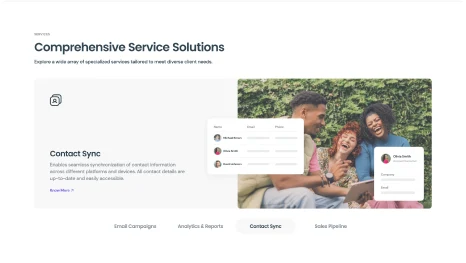
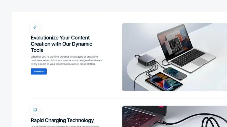
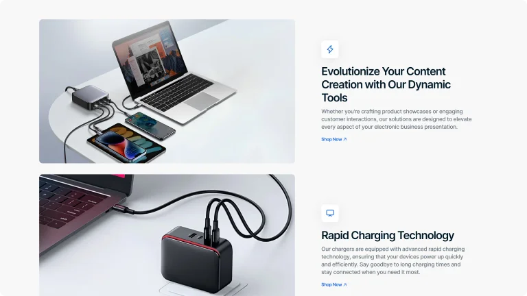
Unique Selling Tools
Digital Includes
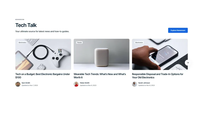
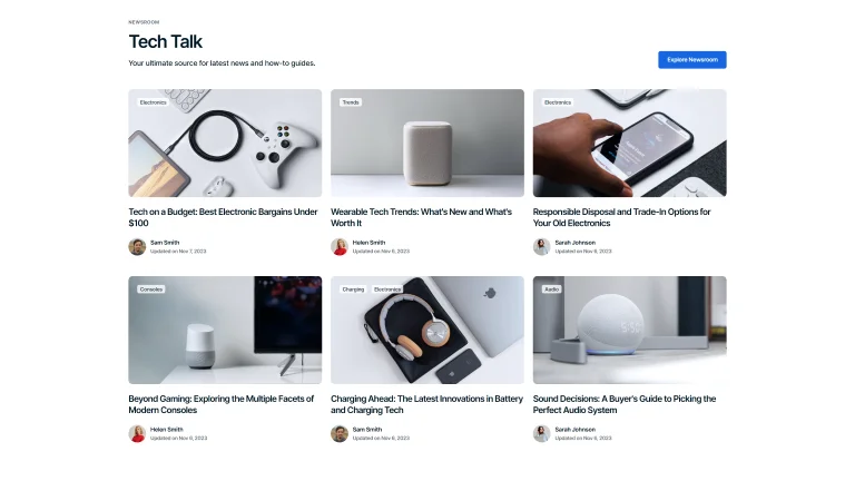
The theme packs a diverse range of customizable sections and sales-boosting features to create the flawless storefront.

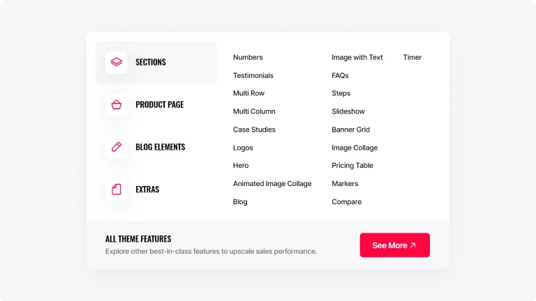
Sections
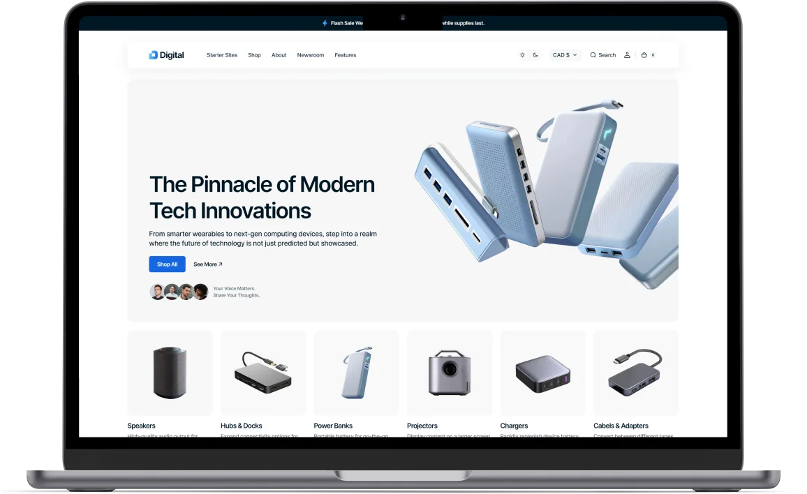
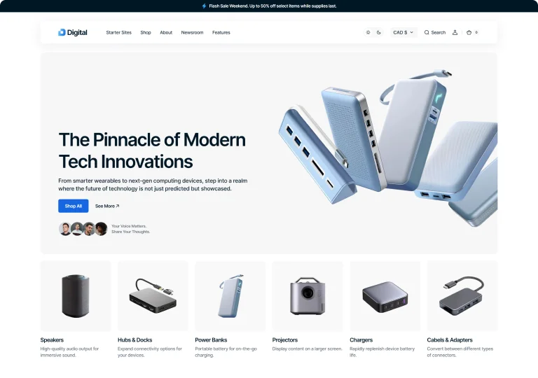
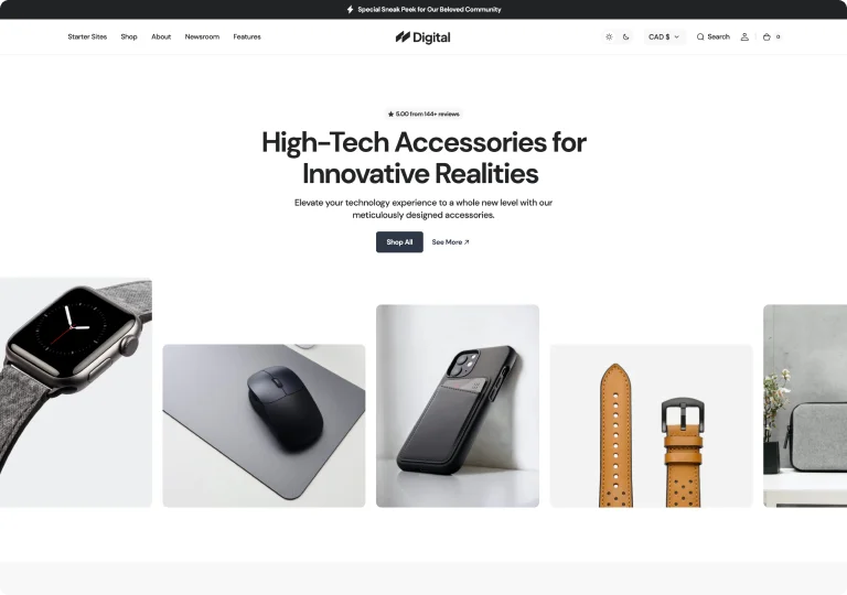
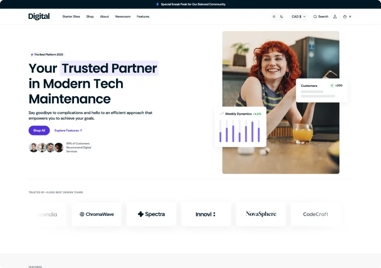
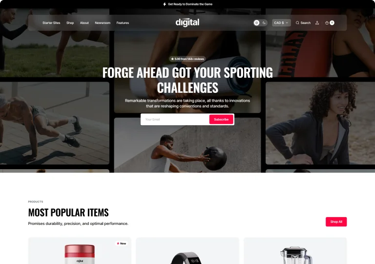
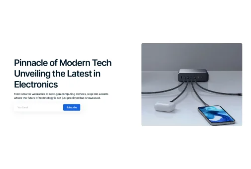
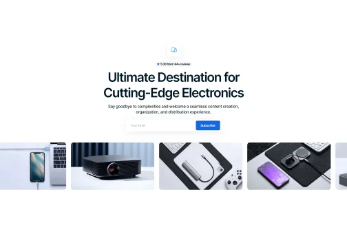
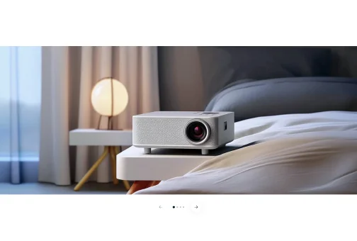
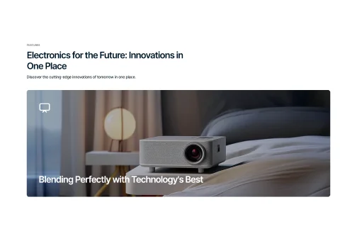
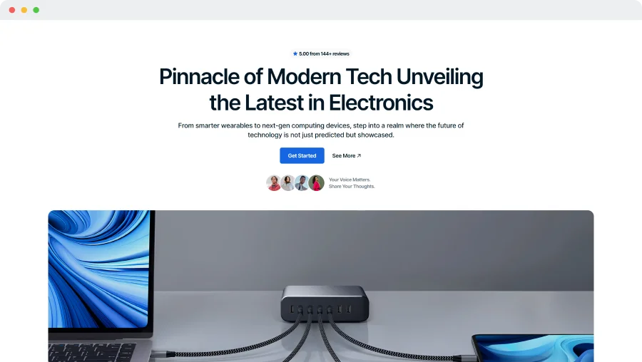
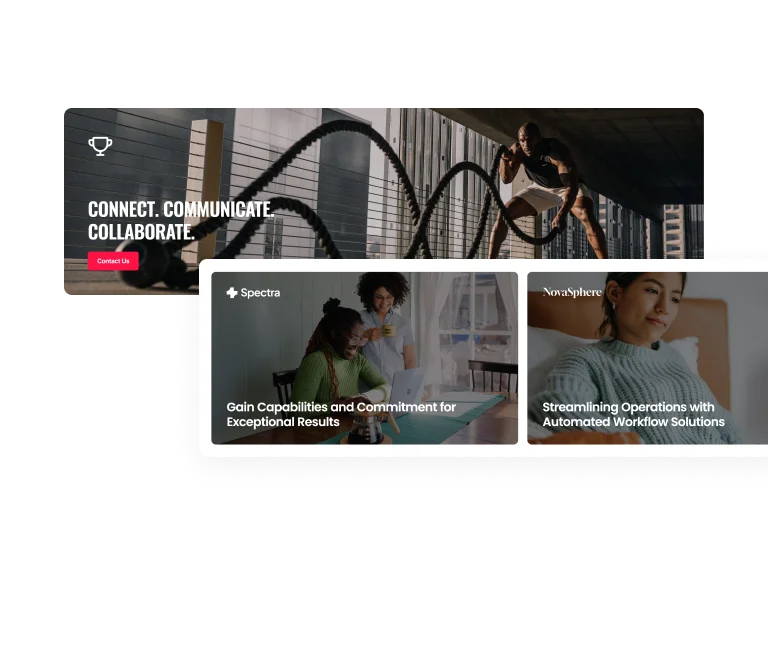
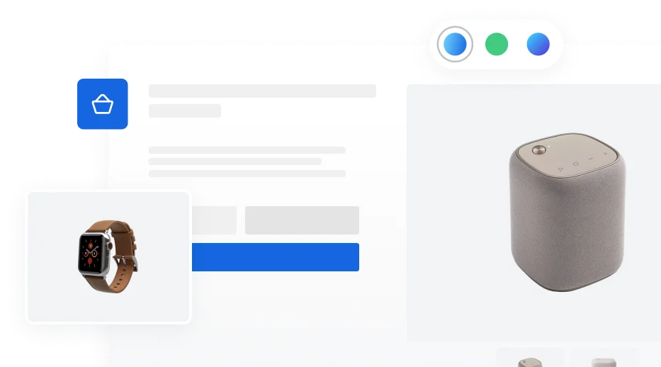
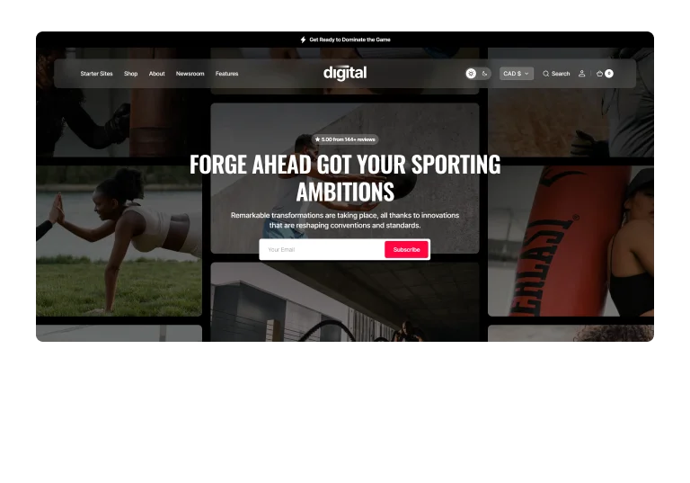
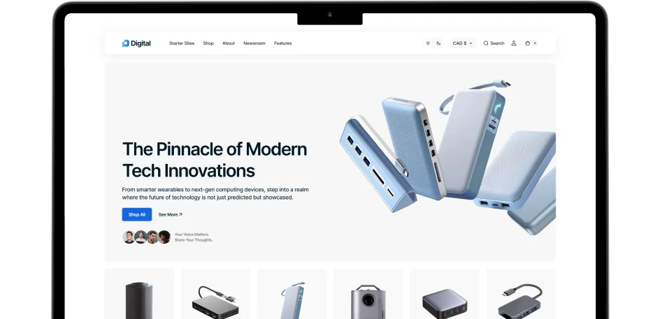
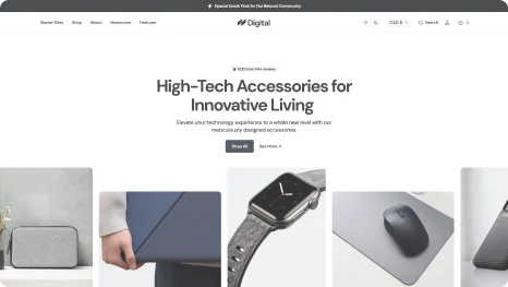
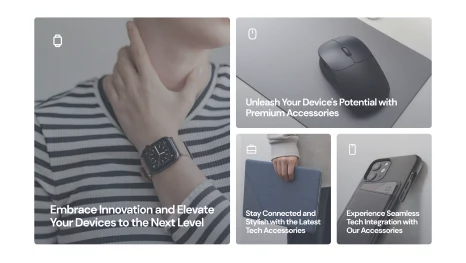
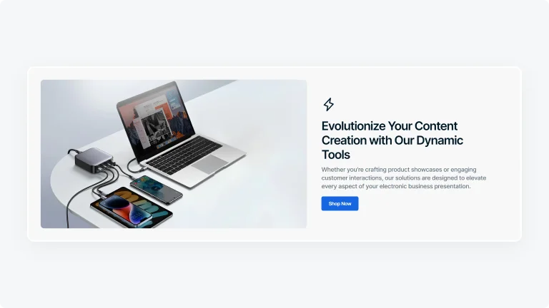
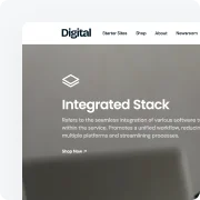
Hero
Multiple hero section options accommodate images, texts, buttons, and more in various styles to enrich your shop with diverse content.
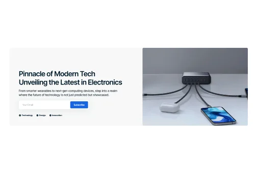
Static Image Background
Highlight your main message and keep user attention on content with a clean, distraction-free static image background.
Side-Aligned Hero with Background
Use a side-aligned hero with a prominent subscription box to highlight your main message, while including space for an image.
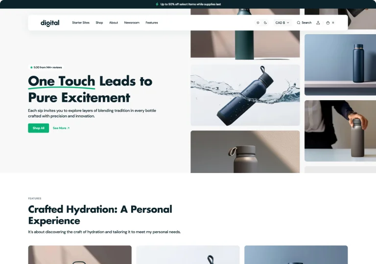
Side-Aligned Hero
Present essential information with a side-aligned hero, featuring a single image for a clear, engaging user experience.
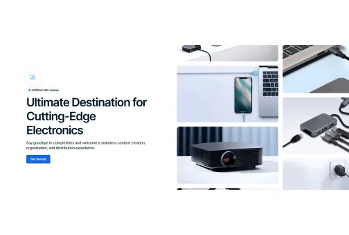
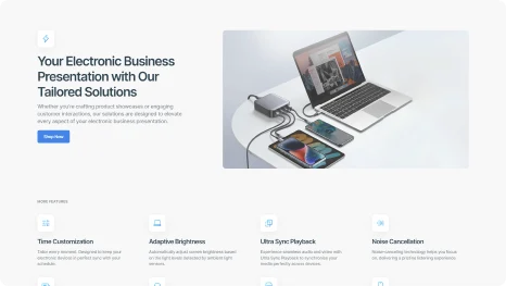
Multi-Feature Static Hero
Implement a static hero layout with a headline, interactive buttons, and customer testimonials to build trust and engagement.
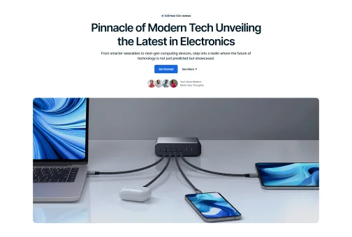
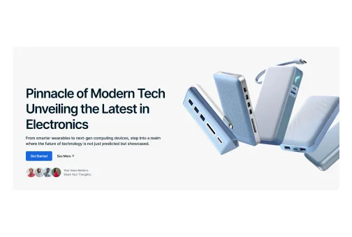
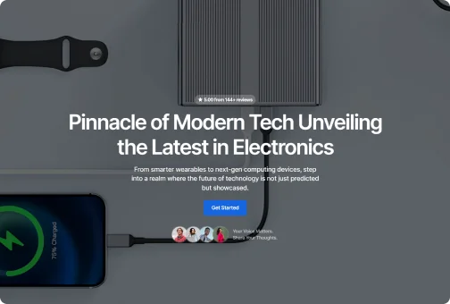
Full-Screen Image Display
Choose a full-screen hero image with interactive buttons and testimonials to captivate and spotlight your key content.
Hero Section Elements to Combine
Combine elements like buttons and tags to create unique sections that perfectly match your style.
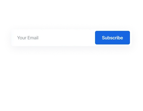
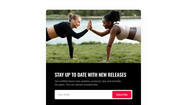
Subscription Field
Place the subscription field in the hero section to collect emails, grow audience and keep them updated.
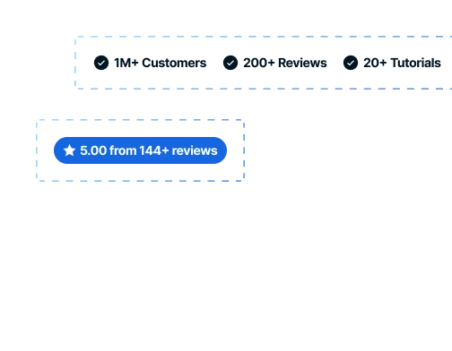
Pre-Designed Icons
Use icons and customizable texts to showcase brand achievements, ratings, customer numbers, and more.

User Icons
Personalize your hero section by showcasing dedicated customers with integrated icons and custom texts.
 Turn On the Video

Features
Heading Animations
Add unique style to your headings with three engaging text animations.
Glowing Digital
Typing
Words appear letter by letter, simulating the effect of being typed on a keyboard.
Glowing Digital
Symphony
Orchestra
Ensemble
Switching
Switches words periodically, drawing attention with focus with a highlighting effect.
Glowing Digital
Symphony
Orchestra
Ensemble
Blinking
Words change in a quick blink, creating an engaging and bold statement for viewers.
Features
Heading Highlightings
Capture visitors' attention with three striking highlighting features that make your statements stand out.
Glowing Digital  Symphony
Symphony
Curved
Highlight your statement with a curved line to emphasize its importance.
Glowing Digital Symphony
Straight
Make an impact with your statement, highlighting a phrase with a straight line.
Glowing Digital Symphony
Selected
Draw attention to specific words and phrases with a text selection effect.
Sections
Slideshow
Highlight multiple products or promotions with a sleek, attention-grabbing slideshow that enhances visual appeal and engagement.
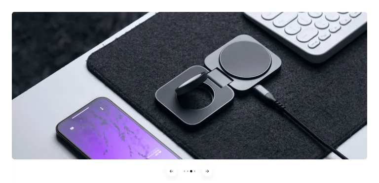
Image with Description
Slideshow with an image on the right bar and textual part on the left.
Full-Width Image
A standard variation of an image slideshow without any text.
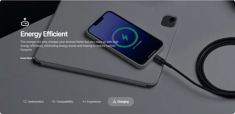
Image with Text Overlay
Captivating, faded image background with an overlay description.
Slideshow Options
Create a unique appearance by mixing varied slideshow and pagination types, and integrating video content.
Icons with Texts
Use descriptive, clickable icons to highlight features or items, making navigation easy.
Active Tab Borders
Highlight the active slide with a distinct border to improve visual navigation for users.

Numbered
Use numbered circles to automatically navigate slides, ensuring a clear and orderly sequence.

Dots
Utilize dot indicators, with or without arrows, for a traditional slideshow experience.
Video Integration

Sections
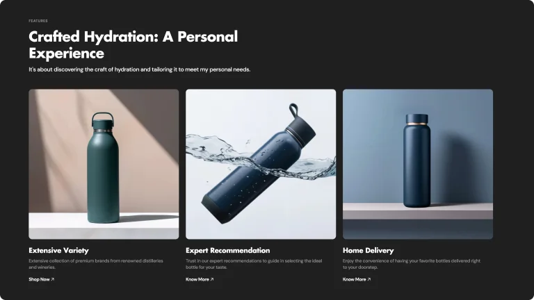
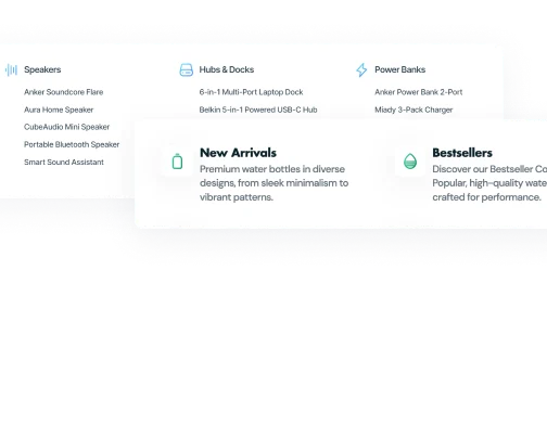
Banner Grid
Discover 8 different types of banner grids to showcase features, products, or promotions in a clear and organized way.
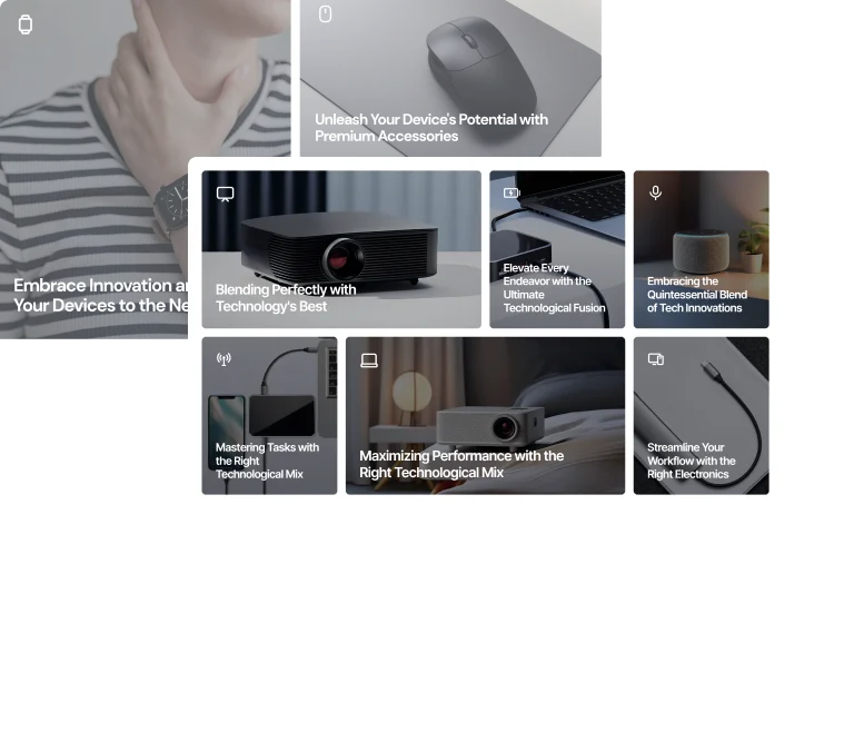
Complex
Choose from multiple complex structures with several columns featuring banners of various sizes.
Compact
Select clean grids with single, double, or triple same-sized banners arranged horizontally.
Features
Refined Dark Browsing
Create a bold and modern interface with refined dark mode, offering optimal contrast and readability.


Easy Toggle Dark Mode
Switch to dark mode for a comfortable shopping experience. Easily toggle between light and dark modes.
Easy Toggle Dark Mode
Switch to dark mode for a comfortable shopping experience. Easily toggle between light and dark modes.

Dark Mode
OnOff
Eye Comfort
Reduces eye strain during low-light conditions.
Battery Saving
Consumes less power on OLED and AMOLED screens.
Visual Appeal
Offers a modern and stylish look to your device.
Focus Enhancement
Minimizes distractions, improving concentration on content.
Spend Less
Complete Toolkit with Single Purchase
Get all the features you need in one purchase, without relying on additional Shopify apps.
Features
Shopify App ANNUAL Cost
SELECT Shopify theme
Predictive Search
$228
 FREE
FREEStock Counter
$48
FREEBack-to-Top Button
$18
FREEColor Swatches
$199
FREEInfinite Scroll
$36
FREEMega Menu
$99
FREEProduct Variants
$240
FREEPopups
$419
FREEAge Verifier
$103
FREEBefore/After Image Slider
$59
FREECountdown Timer
$99
FREECollapsible Content Section (FAQ)
$89
FREESlideshow
$119
FREEIcon Pack Options
$119
FREECart Drawer
$119
FREEQuick View
$191
FREETotal
$2 185PER YEAR
Annual Recurring Fees
$380
One-Time Purchase
The theme comes with a complete suite of features without the need for any additional Shopify Apps
Sections
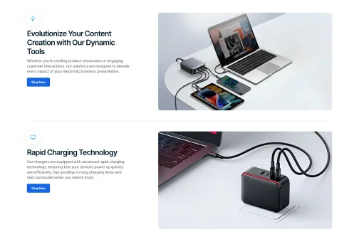
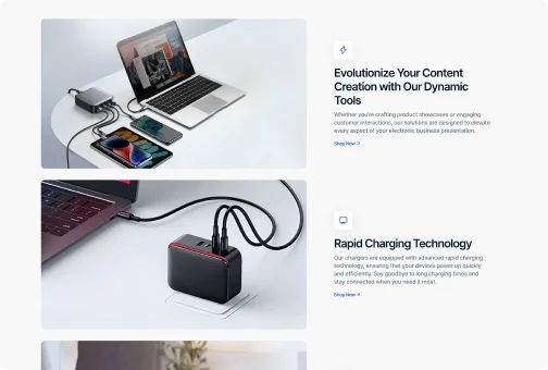
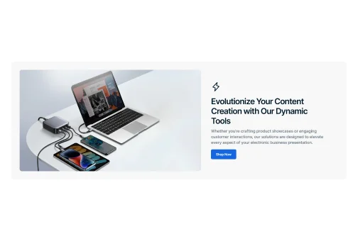
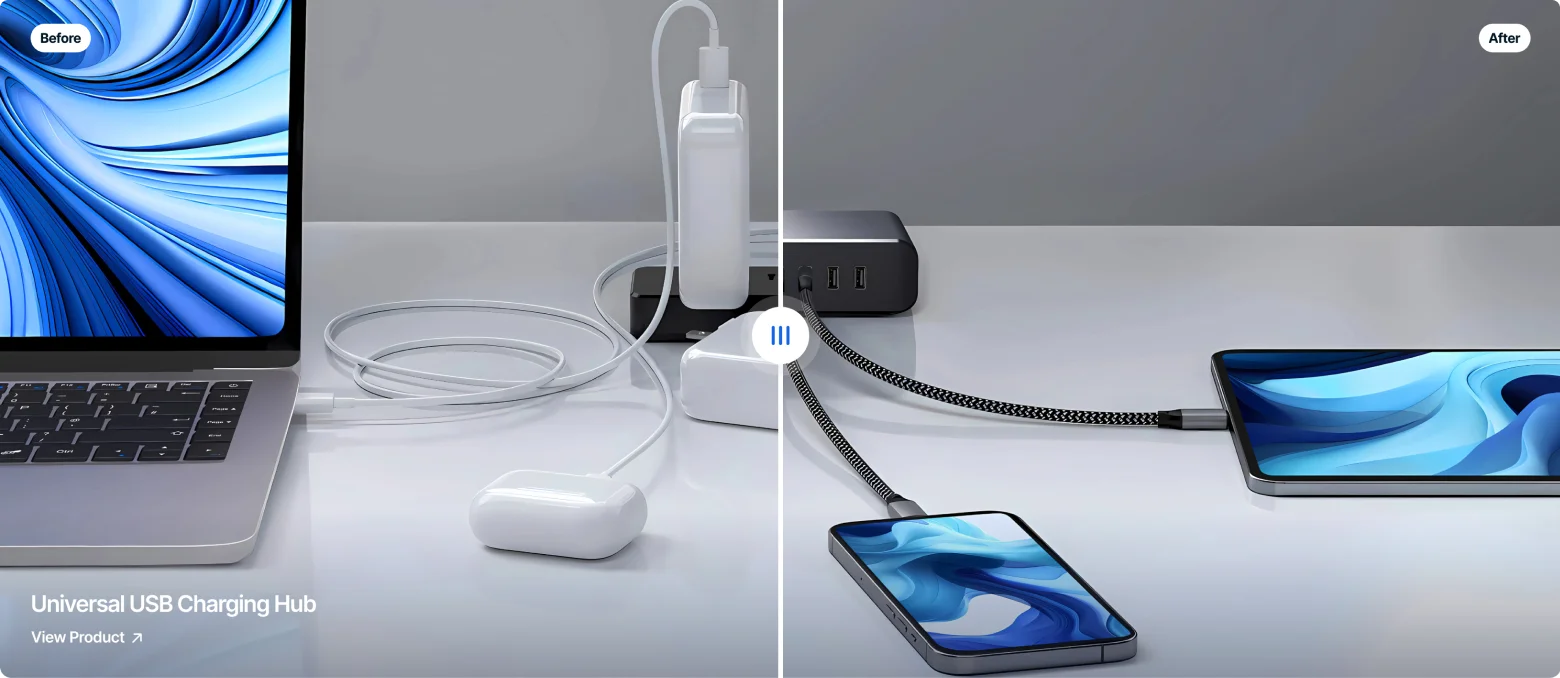
Animated Image Collage
Create compelling CTAs or business visuals with animated collage sections. Increase engagement and make your content stand out.
Horizontal
Vertical
Background

Converting Attributes
Animated image collage section types can be tailored with a variety of customizable attributes to suit your brand and message.

Animation
Add captivating animations where images glide smoothly in various directions, creating an immersive and visually appealing experience.
Pre-Designed Icons
Use a variety of pre-designed icons, customizable with gradient colors to match your brand palette perfectly.
Icons with Customizable Texts
Select icons with customizable text fields to highlight numbers, brand achievements, statistics, or other key information, enhancing visual appeal and engagement.

Value-Adds
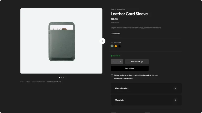
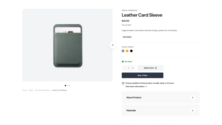
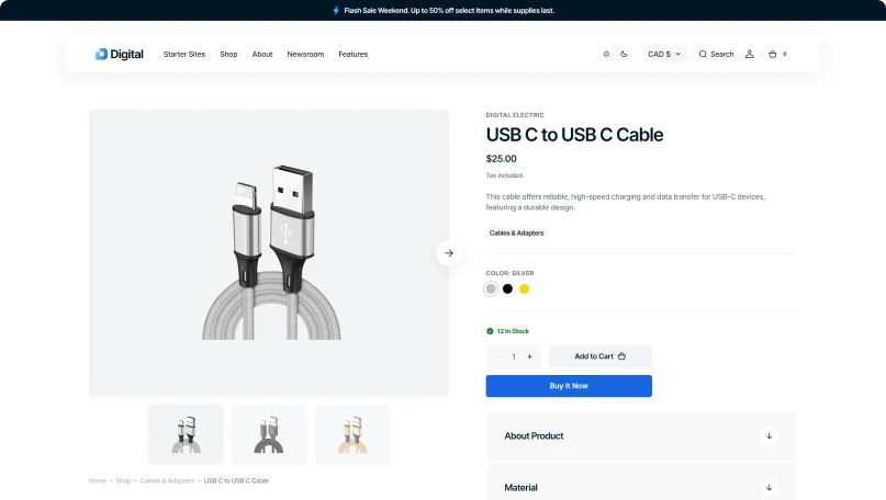
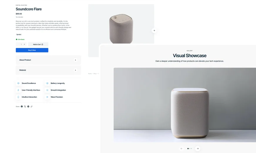
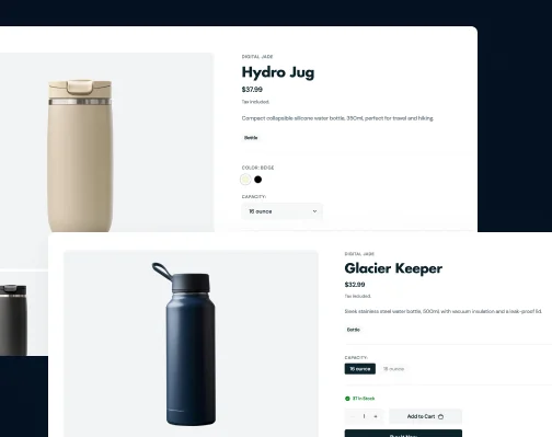
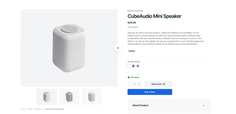
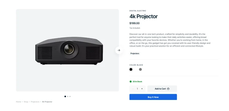
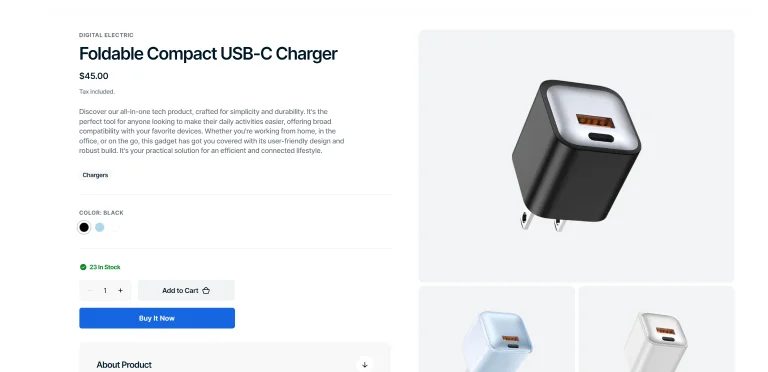
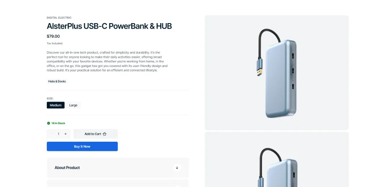
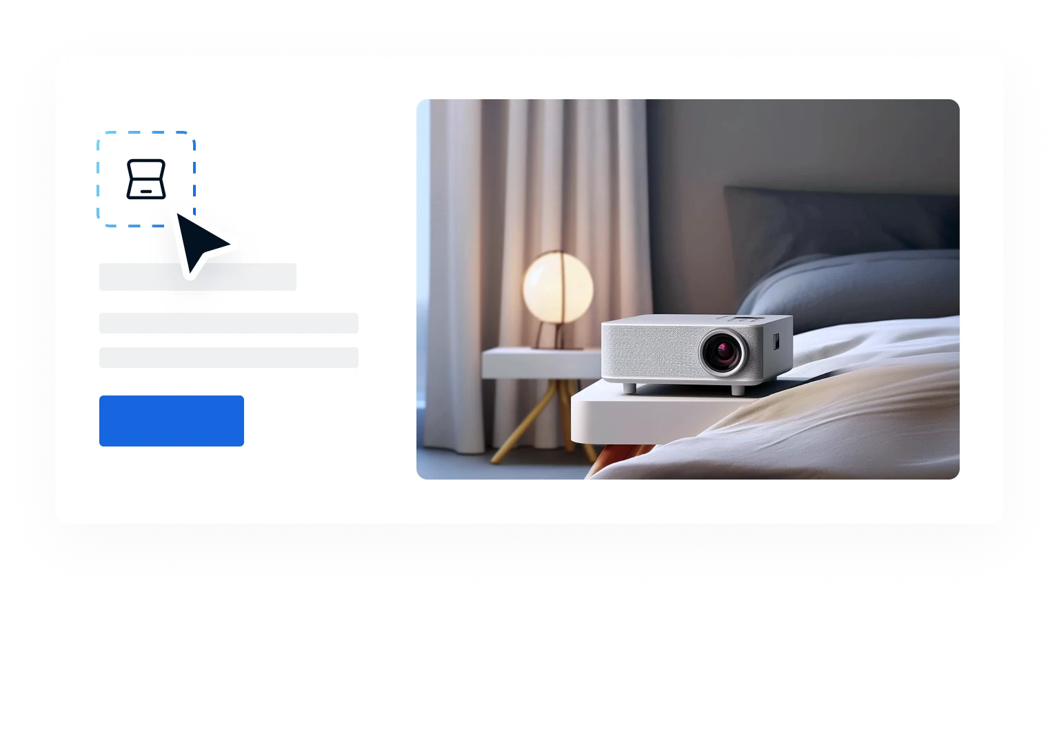
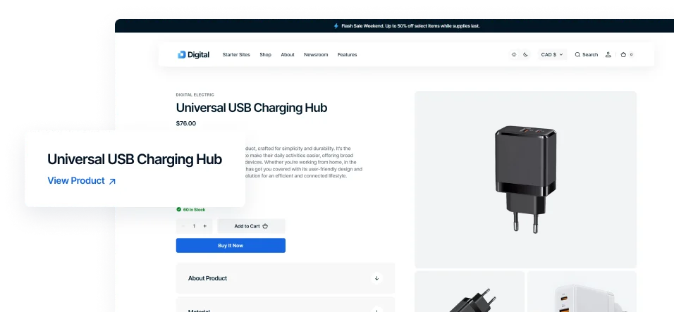
Product Page
Create a product page that converts visitors into buyers with essential info and a smooth shopping experience.
Default
A clean and organized design, focused on providing a clear and easy-to-navigate shopping journey for users.
Slideshow
A captivating image carousel designed to showcase key product features, engage visitors, and drive sales with visually compelling storytelling.
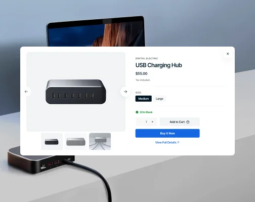
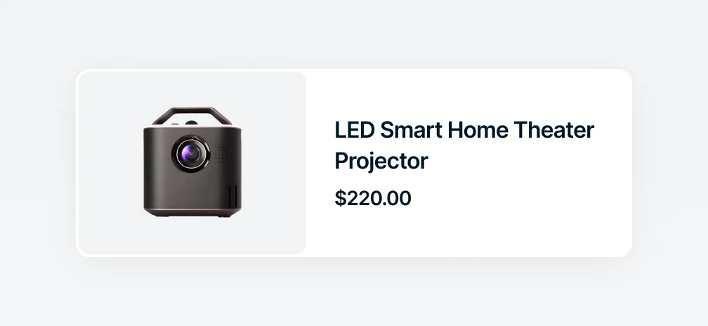
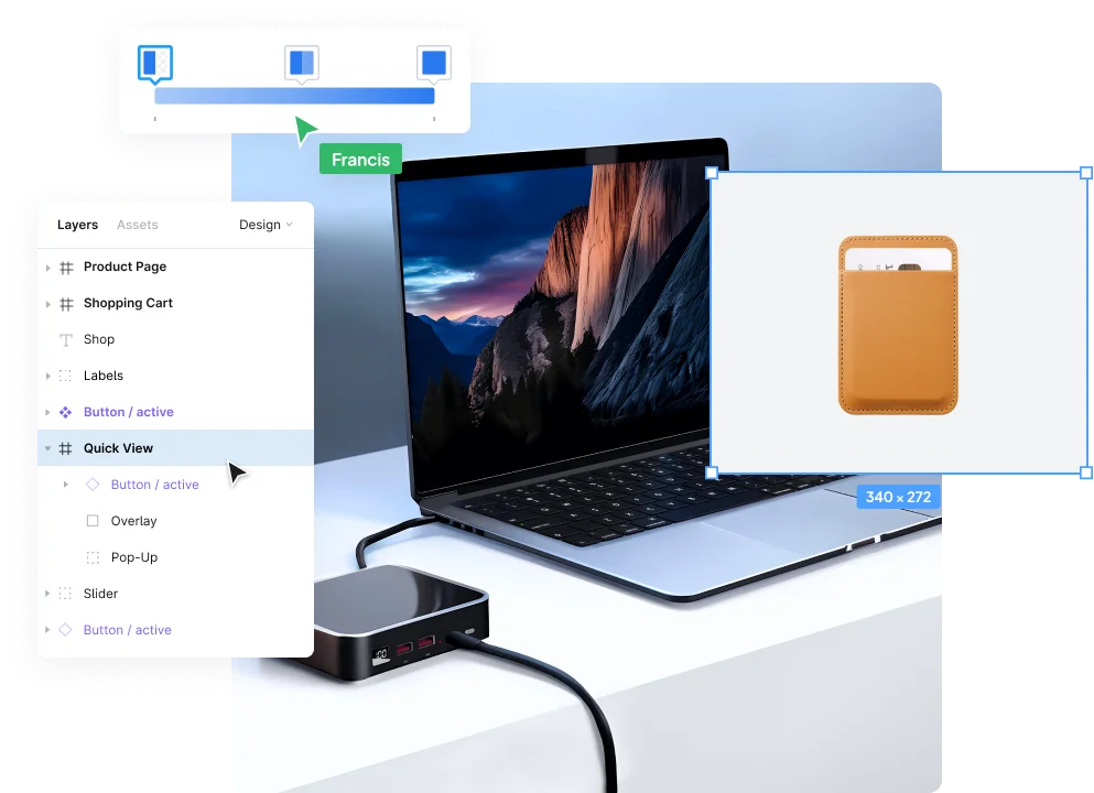
Quick View
Optimize the shopping experience with quick access to detailed product details, keeping the browsing flow smooth and uninterrupted.
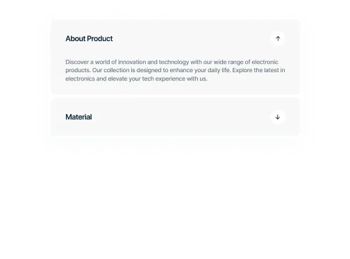
Product Attributes
Provide customers with a simple and clear way to view various product details, making it easier to compare options and choose the right one.

Color Swatches
Offer an intuitive and engaging way for shoppers to see and select product variations, improving decision-making and satisfaction.
Variant Pickers
Make use of flexible tools for selecting product variants, catering to a wide range of products and simplifying the purchase process.
Icons
Use icons from the theme’s unique icon pack to visually communicate the advantages and key aspects of products.

Stock Counter
Show real-time item availability to encourage quick purchases and manage inventory efficiently.
Gallery Variations
Choose from multiple gallery display options to showcase your products in the best light.
Slider with Previews
Showcase products with a main slider and thumbnail previews, offering a quick and comprehensive view.
Slider with Bullets
Add clickable bullets for smooth navigation and quick previews of the next images.
Grid Gallery
Offer an organized layout that provides a broad overview of product images in a structured format.
Stacked Gallery
Display product images in a stacked layout for easy vertical scrolling and seamless viewing.
Sections
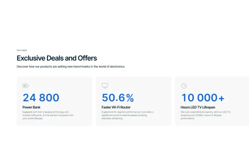
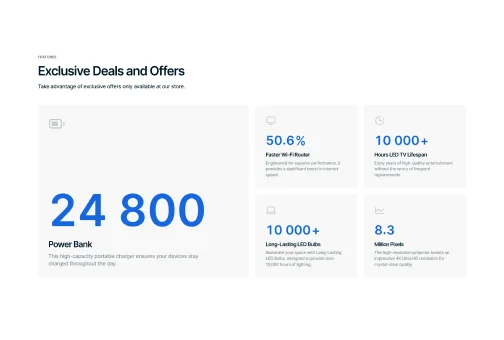
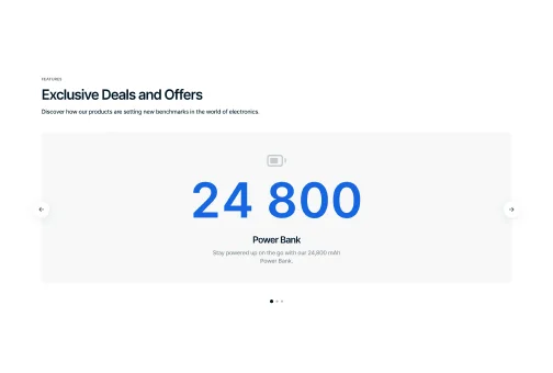
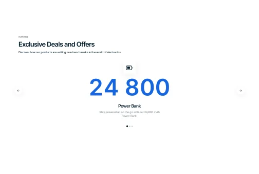
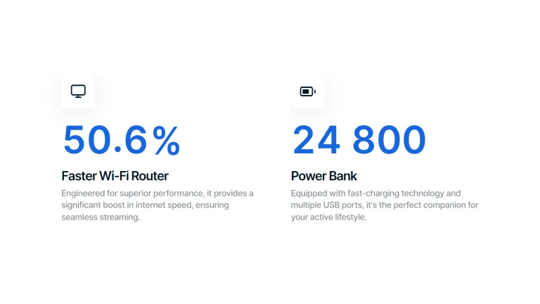
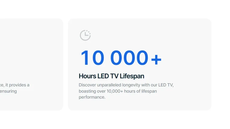
Numbers
Unique animated section to tell about your brand in numbers, featuring many variations to choose from.
Distinctive Icons
Bold, large numbers with accompanying icons and descriptions.
Cards with Descriptions
Numbers and texts are placed in clean, flat cards with minimalist icons above.
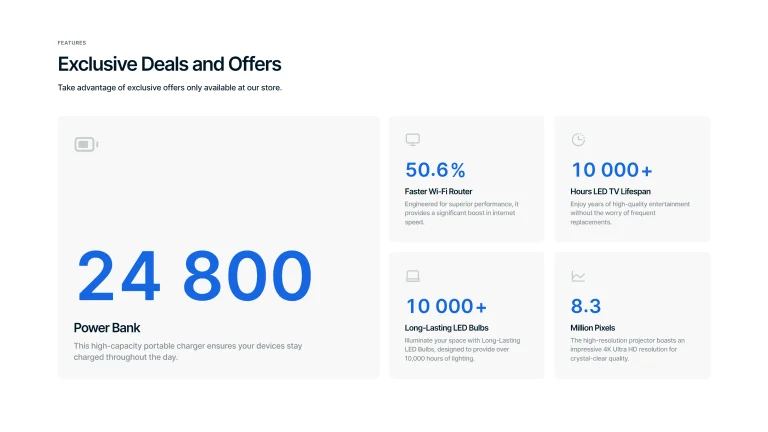
Cards in Columns
More complex structure with one bigger card and several smaller ones in columns.
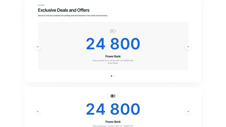
Carousel
Big numbers placed in the center of an interactive carousel with or without background.
Sections
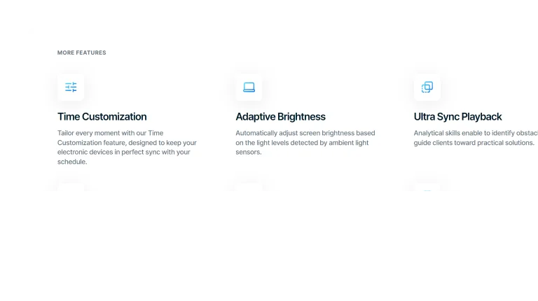
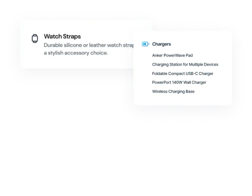
Multi Column
Use multi-column sections to neatly arrange your content, making information more structured, visually appealing, and easy for visitors to navigate.
Can Add Image
Transparent Columns
Use columns without background for a clean layout that directs focus purely to your content.
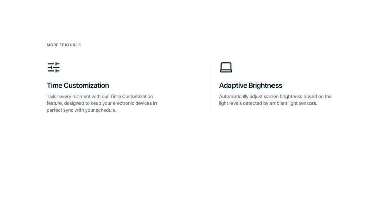
Can Add Image
Bordered Columns
Separate content into columns with distinct borders for organized design and easy scanning.
Can Add Icon
Overlay Columns
Place text with images within columns to efficiently combine visuals and information.
Can Add Icon
Solid Background Columns
Group content in columns with solid backgrounds for straightforward, focused messaging.
Can Be Customized
Modify your multi-column sections with multiple customization options to fit your brand's look and boost your content's appeal.
Basic Transparency
Start with a minimalist multi-column layout featuring a transparent background for uncomplicated content arrangement.
Give a try to pure and simple design.


Icon & Image Integration
Enhance your layout by adding image and customizing icon backgrounds for varied visual effects.
Enhance the look with images and icon customization.

Image Customization
Customize image ratios to add depth, structure, and a polished look to your multi-column sections.
Give it a visual depth along with information.
Features
Header
Create a powerful first impression with a header, offering visitors easy navigation and setting the tone for your content.
Animation
Enable smooth transitions from full-screen to a compact header as you scroll, enhancing the user interface.
Container / Full
Choose between a contained header for focused navigation or a full-screen layout for a bold entrance.
Logo Position
Customize where your logo sits on the header, tailoring its position to fit your brand's style.
Blur
Apply a blur effect to your header for a modern, stylish look that subtly focuses attention on your content.
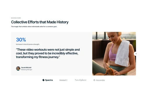
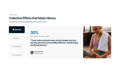
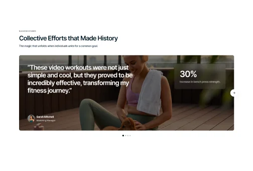
Sections
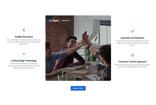
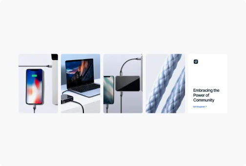
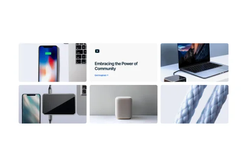
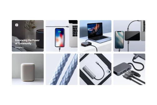
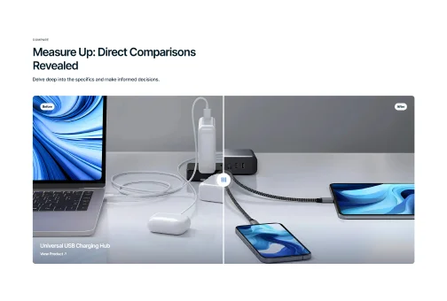
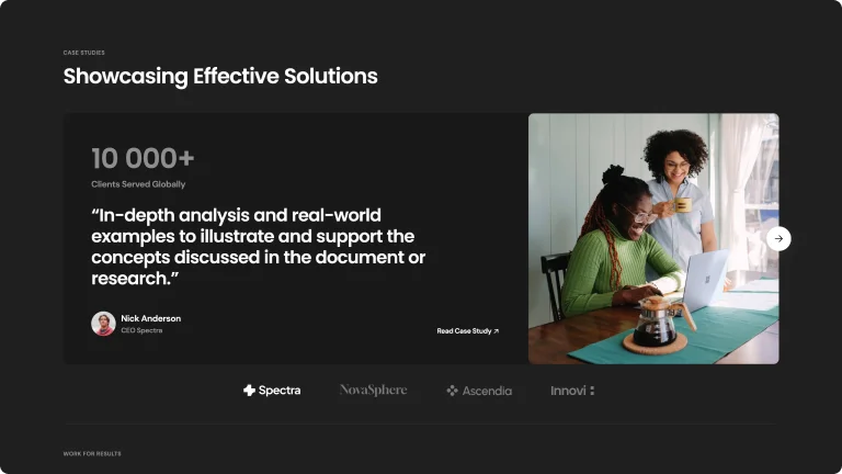
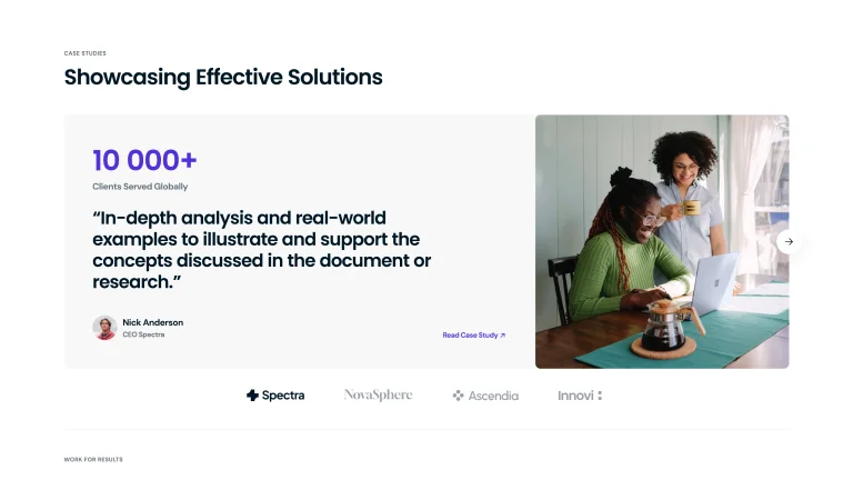
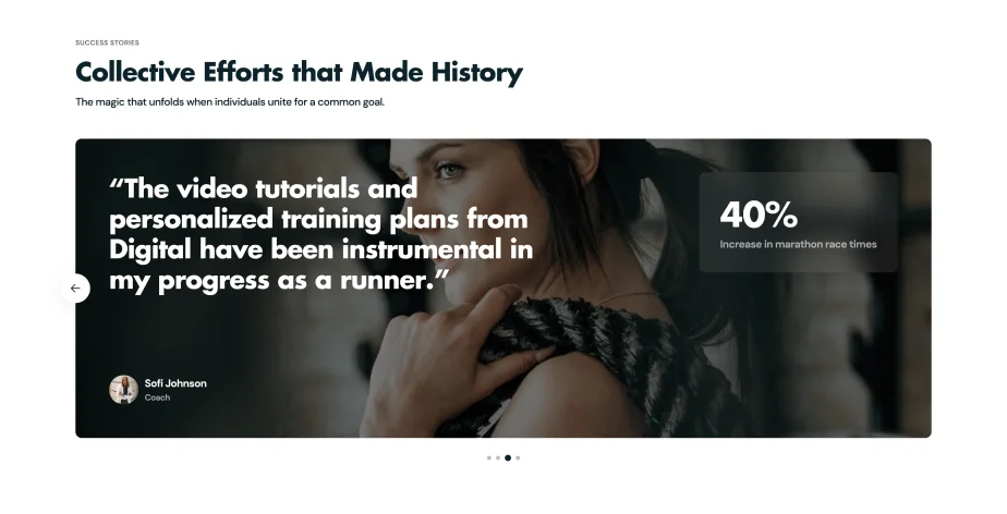
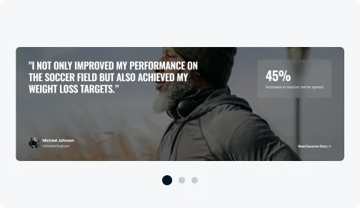
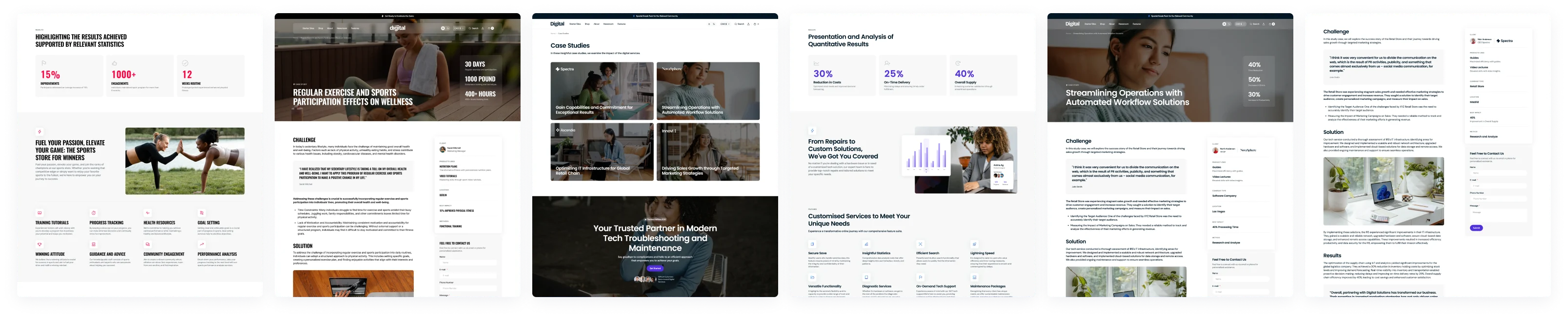
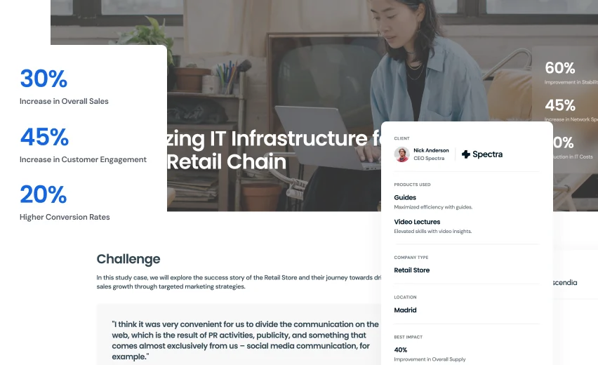
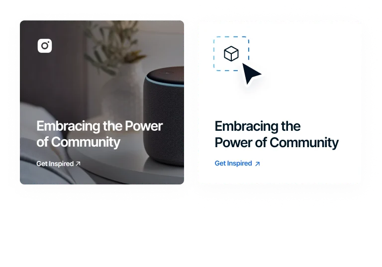
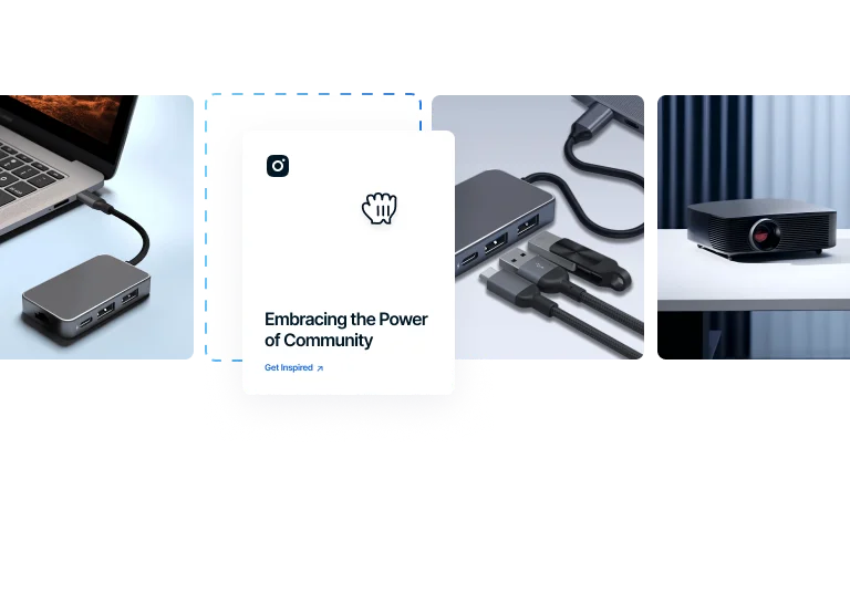
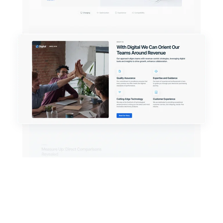
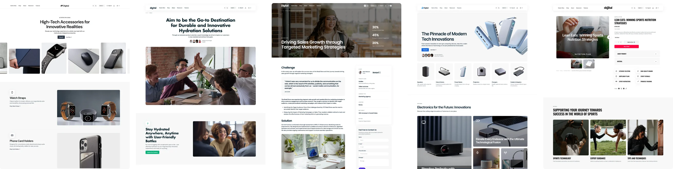
Case Studies
Showcase real-world success stories, demonstrate expertise and offer compelling evidence of your product's effectiveness.
Slider with Logos
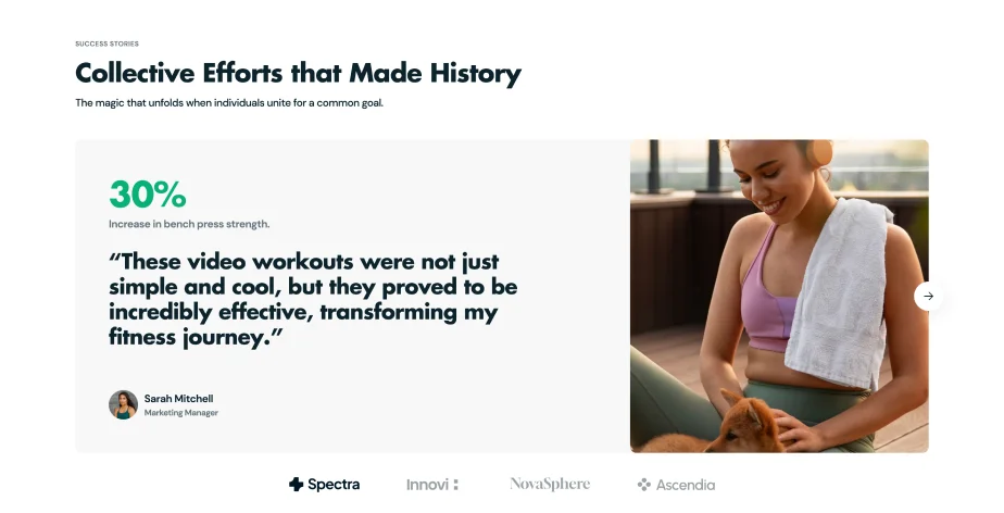
Vertical Logo Selection
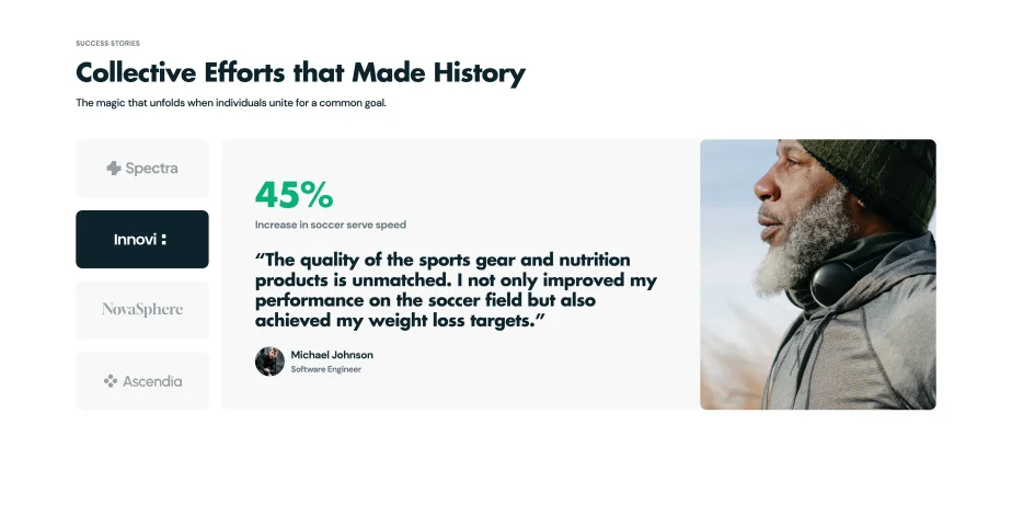
Full-Screen Background Slider
Pagination Variations
Use multiple pagination styles for seamless navigation through case studies, enhancing organization and accessibility.
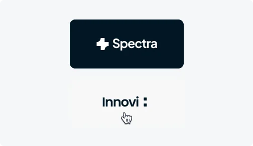
Horizontal Clickable Logos
Display case studies using horizontal logos on a transparent background for easy selection by users.
Vertical Clickable Logos
Arrange case studies with vertical logos against solid backgrounds for clear, straightforward navigation.
Clickable Bullets
Use clickable bullets for a simple way to move through case studies, ideal for quick browsing.
Features
Case Studies Page
Highlight your achievements and build trust with potential customers with a dedicated case studies page.
Flexible Templates
Start with default templates and add any sections to customize your case studies.
Custom Sections
Add specific sections to detail your success stories uniquely.
Intuitive Design
Ensure easy reading and navigation of your success stories.
Engagement Boost
Highlight success stories to build trust and engage visitors.
Value-Adds
Mega Menu
Customize Mega Menu with multiple styles and elements for effortless exploration of your website.
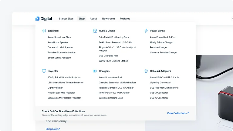
Category Grid Menu
Display all categories and subcategories comprehensively in one expansive view.
Hover-Expand Menu
Showcase a compact and organized mega menu display with a hover effect on subcategories.
Mega Menu Options
Customize the Mega Menu with multiple styles and elements for easier navigation and a more streamlined user experience.
Columns
Organize your menu items into neat columns for a clean, easy-to-navigate layout.
Icon Style
Add visually appealing icons next to menu items to guide users with easy-to-recognize visual cues.
Text/Submenu
Use text-based submenus to keep your menu items organized and easy to navigate.
Sections
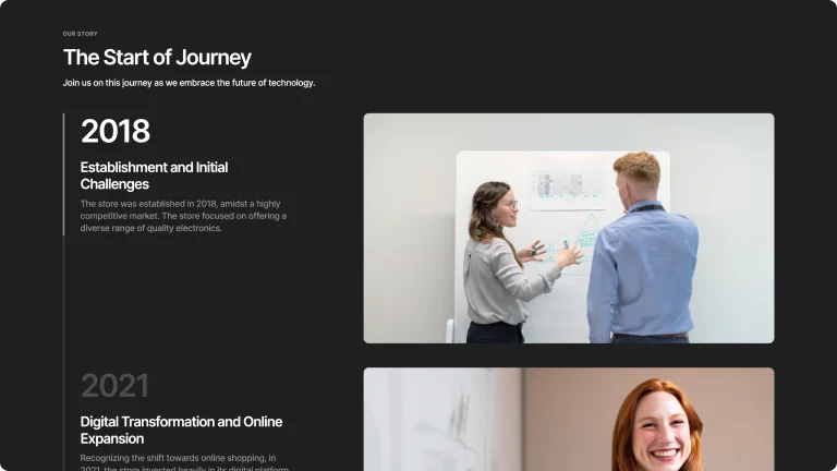
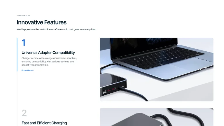
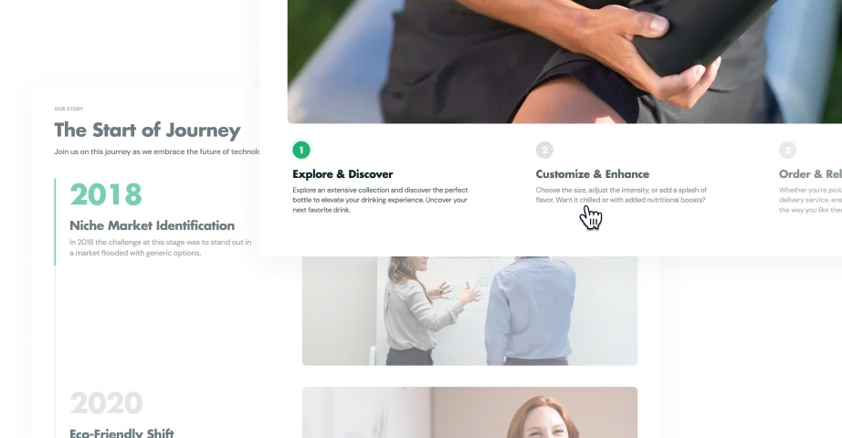
Steps
Share a clear, step-by-step explanation of processes or detailed instructions for your customer.

Vertical Layout
Highlight animated, numbered steps vertically with an image on the right for a concise presentation.

Horizontal Layout
Arrange numbered images, descriptions, and CTA buttons in a horizontal format for easy navigation.
Scroll Layout
Sequentially display detailed information as users scroll, with images on the right.
Full-Width Image
Include a large image with animated, numbered steps and texts underneath for an engaging carousel.
Value-Adds
Catalog
Use a customizable catalog with various layout options and advanced filtering features to enhance the shopping experience.

2-5 Product Cards
Products per Row
Display anywhere from 2 to 5 product cards per row to best suit your store's design and product visibility.
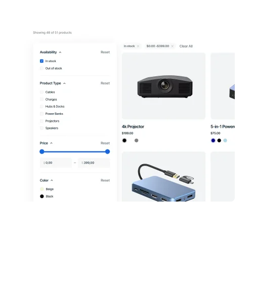
Vertical Products Filters
Use vertical filters on the side of your catalog for straightforward sorting by different criteria.
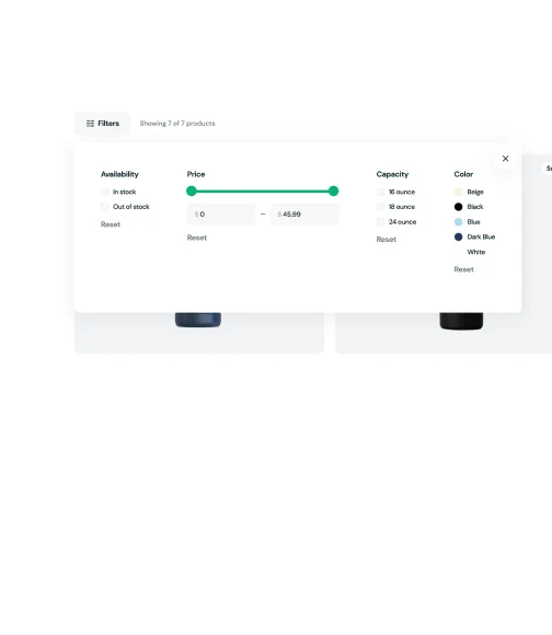
Horizontal Products Filters
Place filters horizontally above your product listings for an easy-to-see and time-saving filtering.
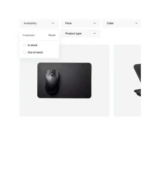
Traditional Products Filters
Implement drop-down filters for a classic well-known filtering approach.
Features
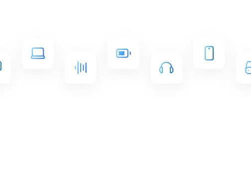
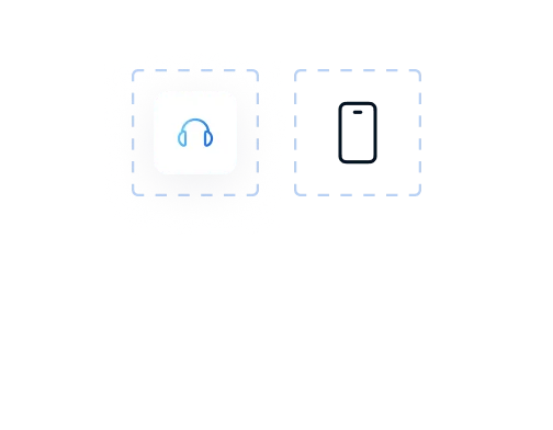
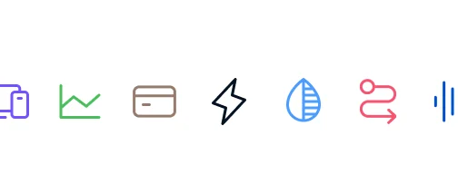
Icons
Choose from a wide range of native icons to create a cohesive and visually appealing design.
Gradient
Gradient colorings bring a multi-dimensional look to icons, enhancing the visual appeal of your store's design.
With / Without Shadow
Icons can feature shadow backgrounds for depth or be shadow-free for a cleaner appearance, depending on your preference.
Style
Colored styles are customizable for a personalized touch, while subtle and contrast options provide pre-defined aesthetics.
Use Our Big Pack
Access to an extensive icon pack gives you a wide range of choices to perfectly match any site section or feature.
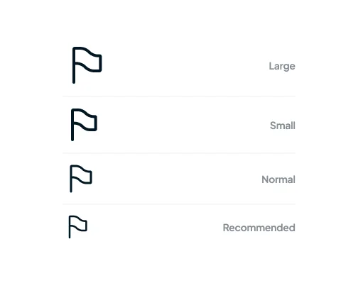
Size
A variety of sizes from large to small, including a recommended option, ensures icons fit seamlessly into your lay.
Solid
Solid color fill options allow for tailored icon appearances, easily integrating with your site's overall color theme.
Sections
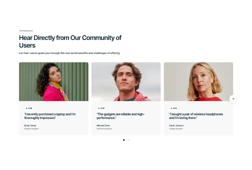
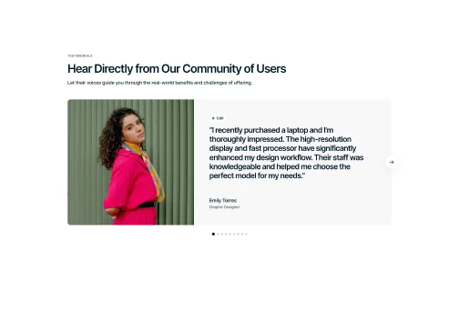
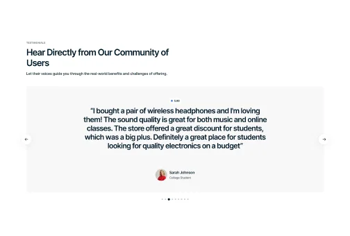
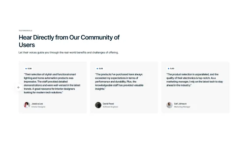
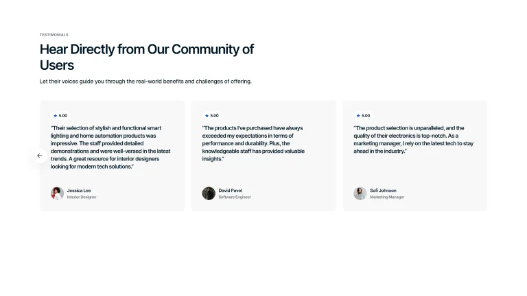
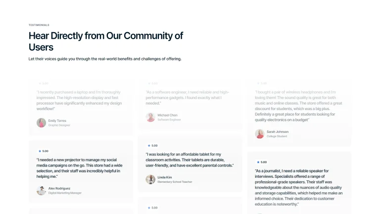
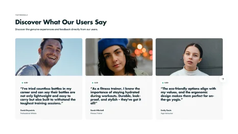
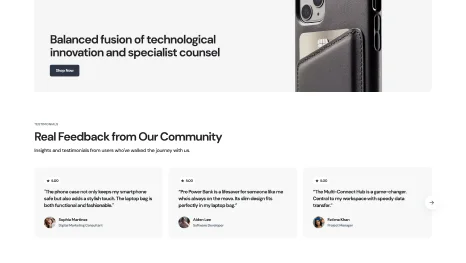
Testimonials
Build trust and credibility with potential customers by providing testimonials about product quality and company's reliability.
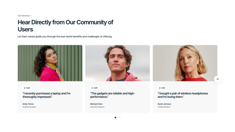
Testimonials Slider
Navigable testimonials with a rating, customer quote, and images, either large at the top.
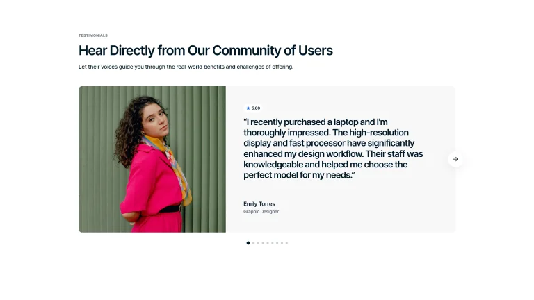
Single Card Testimonial
An interactive carousel with an image on one side, text, and rating on the other.
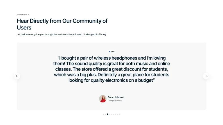
Quote Card Carousel
Carousel with a large quote, rating at the top, and smaller customer image on the bottom.
Quotes Carousel
Navigable testimonials with a rating, customer quote, and images, either small at the bottom.
Animated
An interactive version that cycles through testimonials with engaging animation.
Features
Sections
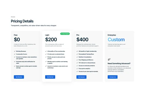
Pricing Table
Show different membership plans with detailed lists of features and benefits, and engaging icons, making it easy for customers to compare options.
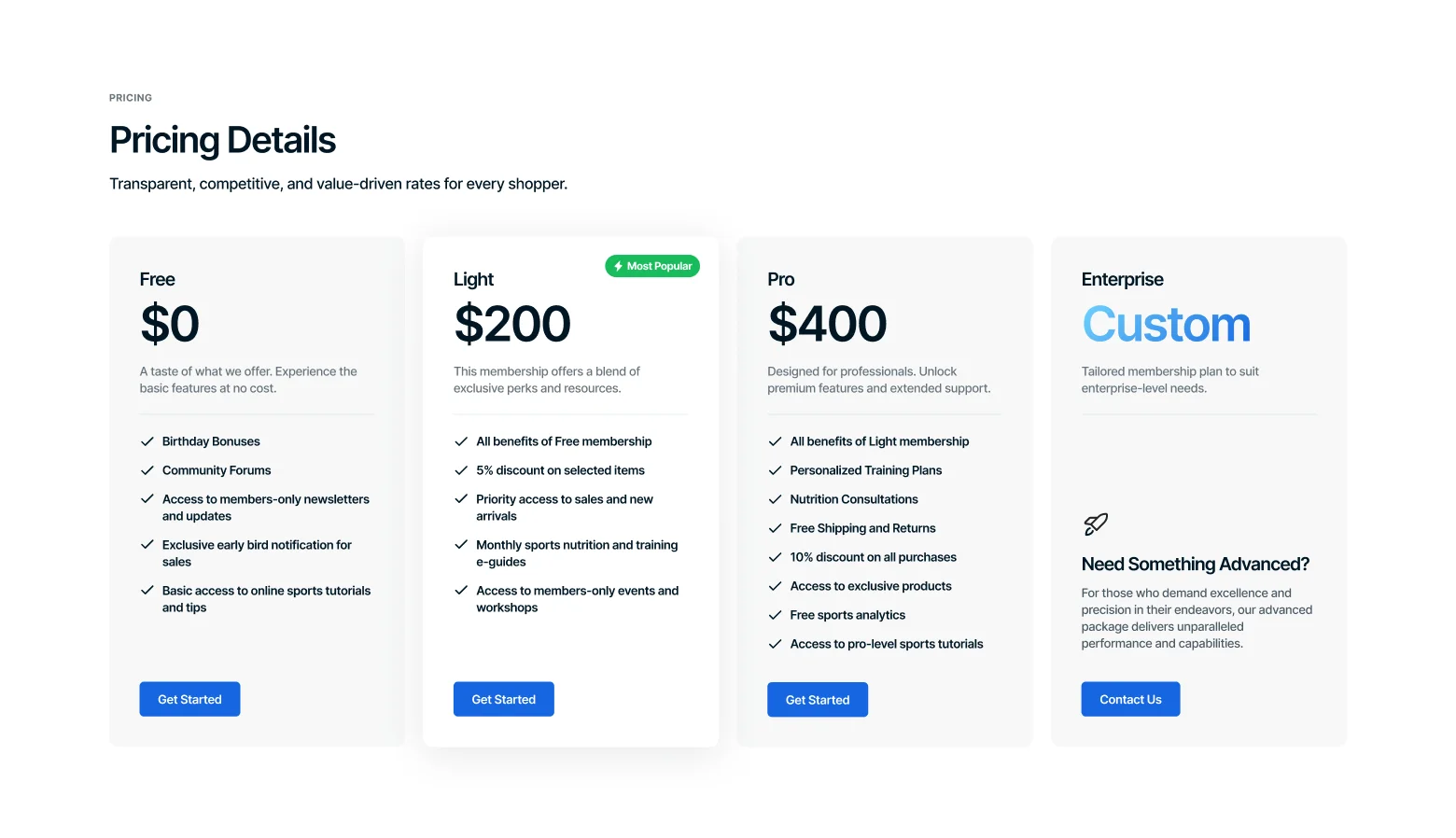
Extensive Customization
Customize colors, fonts, and spacing to match your brand's style.
Icon Support
Add a huge variety of icons into the table’s custom blocks.
Flexible Content
Include a wide range of content types, from texts to links and buttons.
Responsive Design
Ensure pricing tables automatically adjust for optimal viewing on any device.
Value-Adds
Shopping Cart
Optimally sized and feature-rich shopping cart, designed to make every purchase smooth and straightforward.
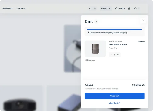
Compact Size
Offer your customers a streamlined shopping experience with a sliding compact cart design.
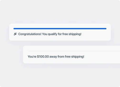
Free Shipping Goal
Encourage larger orders and sales by providing a visual real-time progress bar for free shipping.
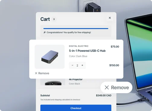
User-Friendly Navigation
Simplify cart adjustments for customers with intuitive controls for product quantities and easy removal options.
Sections
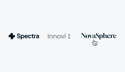
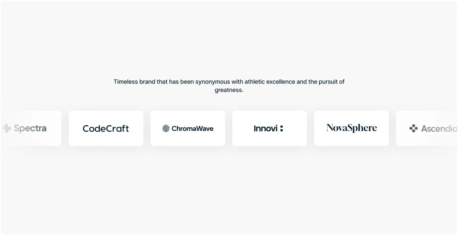
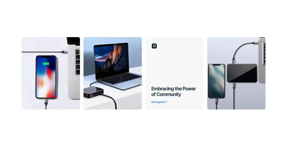
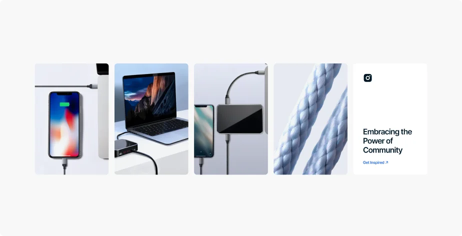
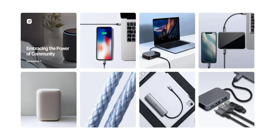
Logos
Showcase your partners in a horizontal or vertical animations along with descriptions, or a simple, static arrangement.
Static Display
Horizontal Slider
Vertical Slider
Features
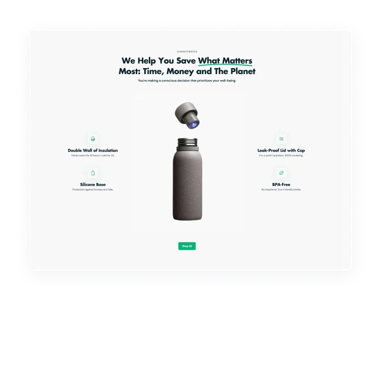
Product Hotspots
Add clickable markers to your product images, allowing customers to easily identify and learn more about items shown in pictures.
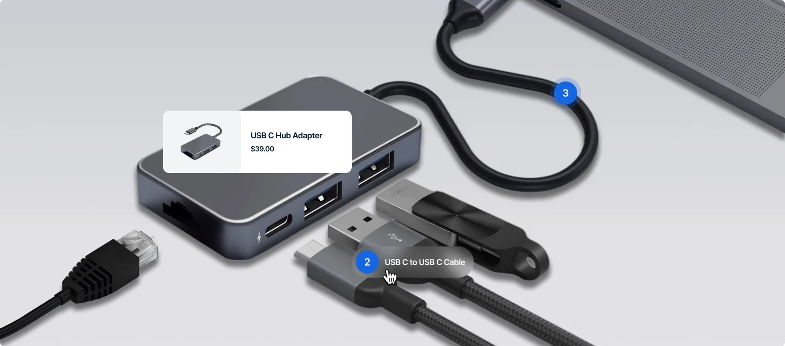
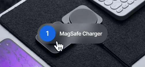
Eye-Catching Hover Effect
Highlight product names with engaging hover effects on markers, instantly drawing attention to items in images.
Miniature Product Card
Present a compact product card with a single click, showing the item's name and price for quick reference.
1
Number Animation
Engage users with animated numbers that provide essential product information when they hover over markers.
Value-Adds
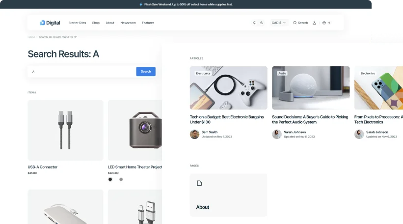
Search
Allow fast and precise search results for an improved user experience and boosted sales.
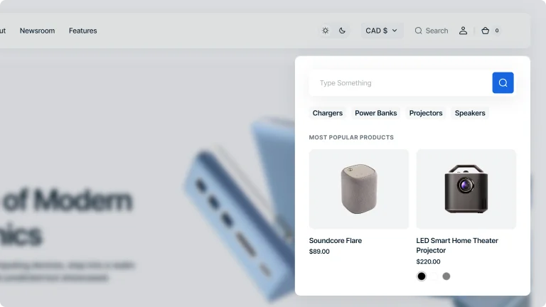
Advanced Search
Offer in-depth filtering options with advanced search, allowing users to narrow down results based on specific criteria for precision.
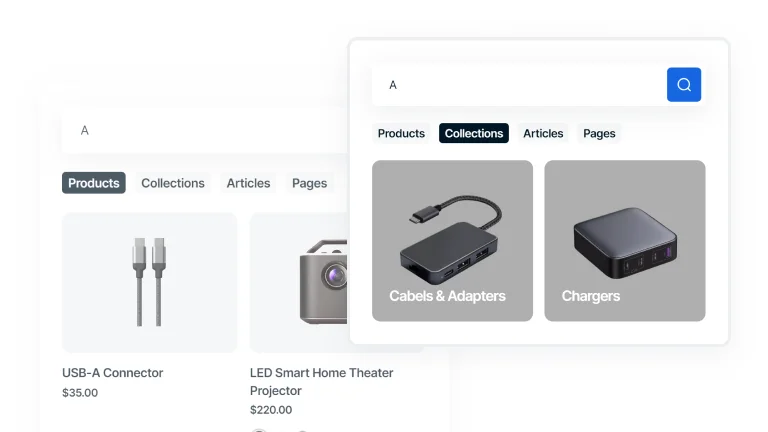
Predictive Search
Enhance the search with predictive text, offering real-time suggestions as users type to quickly guide them to relevant results.
Sections
Multi Row
Easily create sections with multiple rows to display text, images, and videos in a structured and visually appealing way.
Bordered Rows
Divide content into distinct rows with clear borders and separators for organized sectioning.
Transparent Background Rows
Present multiple sections within a multi-row layout that flows without visual breaks, thanks to a transparent background.
Bold Background Rows
Define each row with solid, vivid background to make each section pop and stand out distinctly.
Add Icon
Use icons from the theme's built-in icon collection to visually enhance your multi-row sections.
Video Available
Add videos to multi-row sections to enhance engagement and create an interactive experience.
Features
Compare
Showcase your products side by side or highlight their transformative benefits using a responsive comparison tool.
Sections
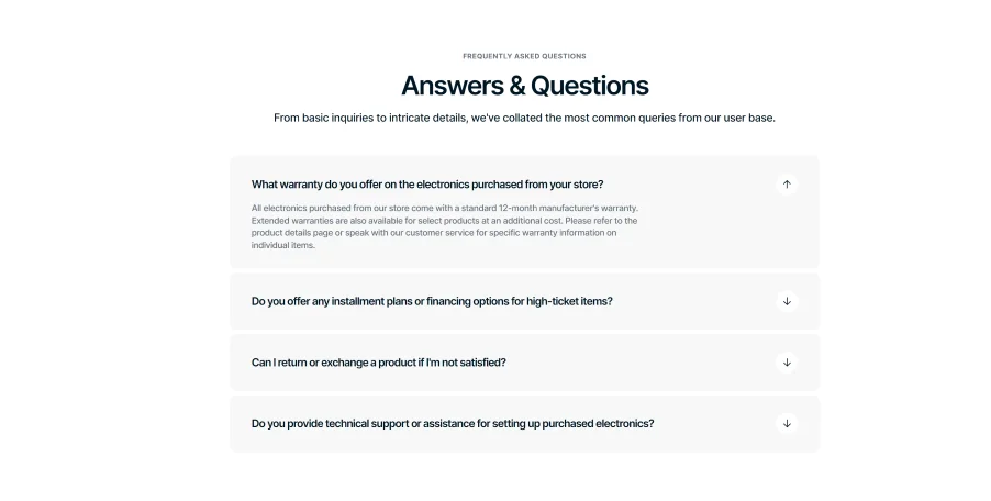
FAQs
Organize your customer support with a collapsible FAQ section, making it simple for users to find answers to common questions with just a click.
Interactive Hover FAQ
Hovering over a question makes it bold for emphasis. Clicking opens the answer while muting surrounding content to maintain focus.
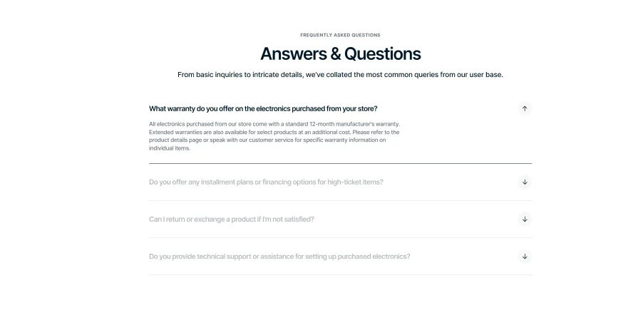
Distinctive Accordion FAQ
Collapsible FAQ sections with unique backgrounds for clarity. Clicking opens the answer while visually separating each Q&A pair for easy reading.
Features
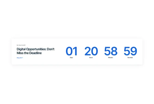
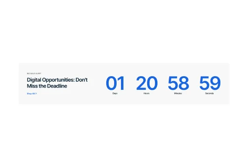
Countdown Timer
Generate FOMO by displaying a countdown timer that ticks down to a specific event or deadline, prompting users to act before time runs out.
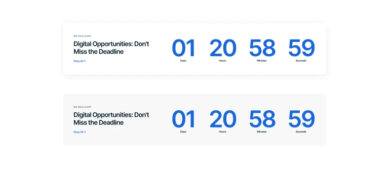
Basic Countdown Timer
Set up a simple timer banner with a customizable background to focus attention on limited-time offers.

Full-Backdrop Countdown
Use a full-screen image background with an integrated timer to immerse customers in time-sensitive promotions.
Sections
Image Collage
Build engaging image collages with a range of styles and customization features to align perfectly with your brand.
Portrait
Vertical

Landscape
Square
Informational Block Overlay
Add text and icons to your collages for quick information on images, using the theme's icon pack for visual aids.
Build Blocks to Your Preference
Arrange your content with flexible blocks, placing text anywhere within the collage to suit your design needs.
Features
Popups
Develop branded pop-ups with strategic timing triggers to enhance effectiveness and engage customers at right moments.
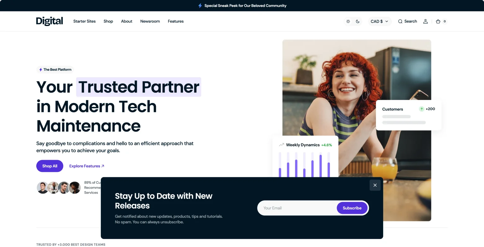
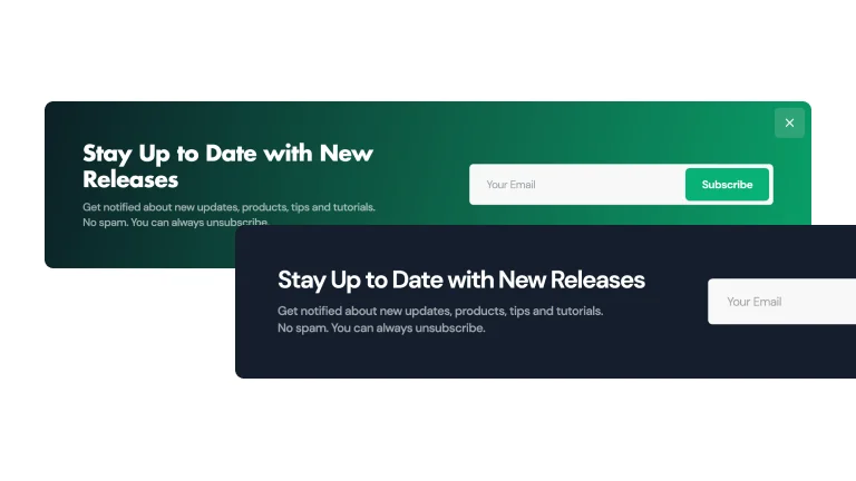
Gradient or Solid
Use a gradient or solid color background to create pop-ups that blend seamlessly with your site's design.
Image
Enhance your pop-ups with images to create a visually engaging experience that instantly captures attention.
Scroll
Present popups as users scroll down the page, ensuring content is presented at the most engaging moments.
Time Delay
Schedule popups to appear after a predetermined time duration, ensuring optimal visibility.
Exit Intent
Display targeted messages as customers hover their mouse to exit seize the final opportunity to engage.
Sections
Image with Text
Select the ideal layout to feature images alongside text, creating a customized look for your content.
Content Focus Layout
Text with images side by side, emphasizing content equally and providing an informative, balanced view
Feature Highlight Layout
Text overlay a focal image, drawing the viewer’s attention to specific product features or messages.

Features
Sections
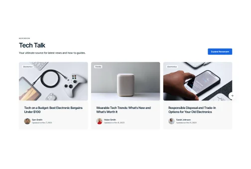
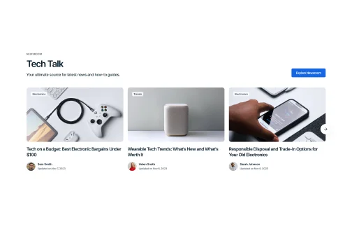
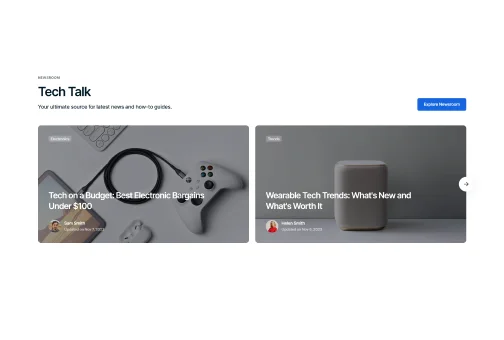
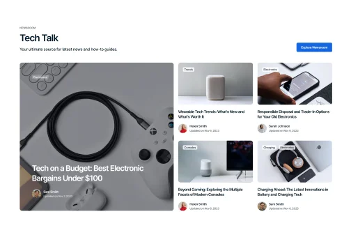
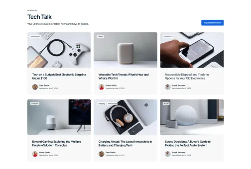
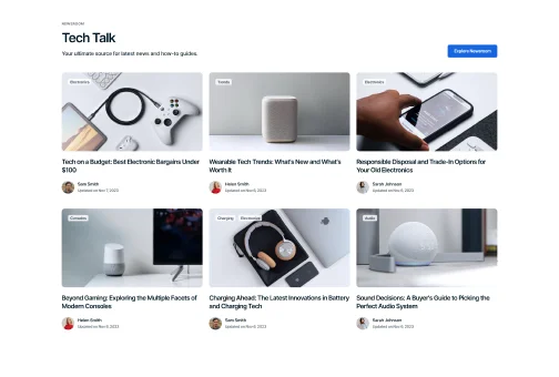
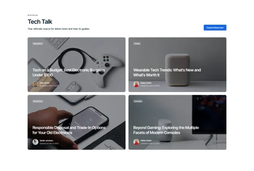
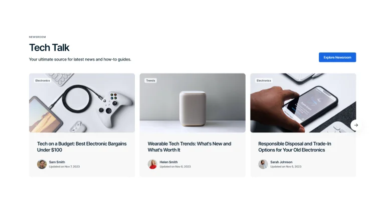
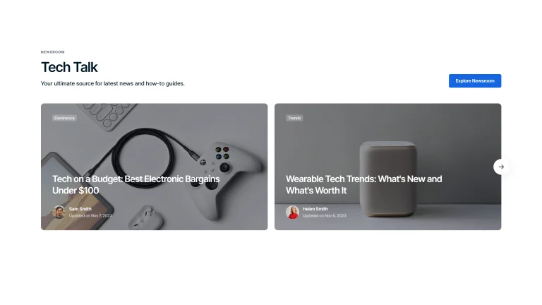
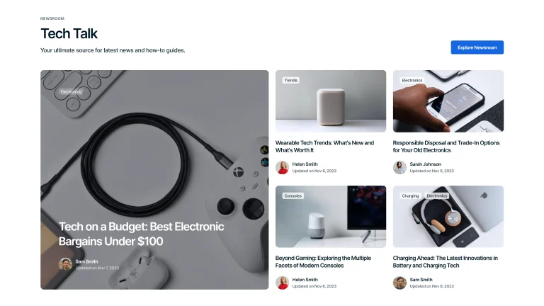
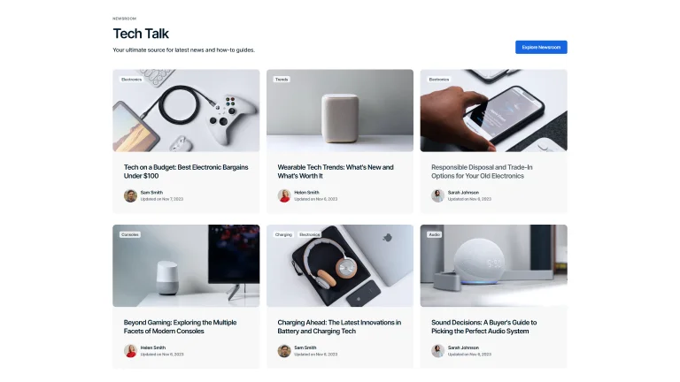
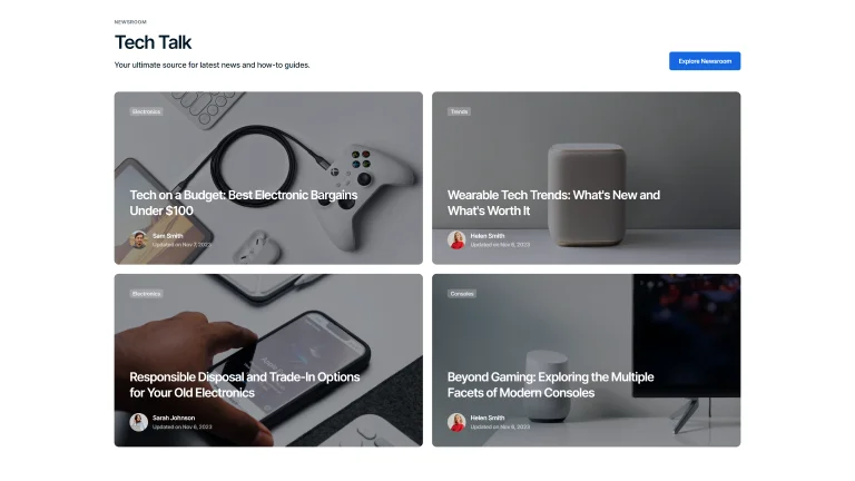
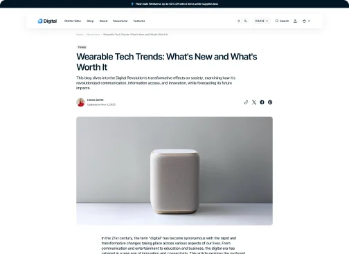
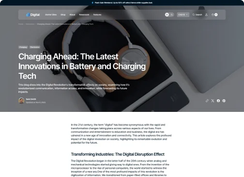
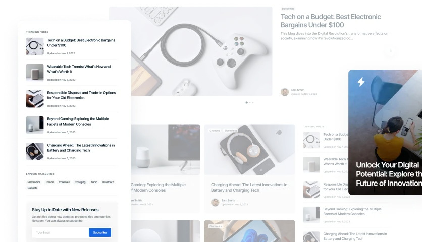
Blog
Enhance the reader's journey with versatile blog layouts, offering various ways to showcase your posts.
Slider with Bold Background
Streamlined slider layout, where articles are displayed in a row against a consistent background, offering a seamless reading experience.
Slider with Transparent Background
Clean lines and a side-by-side setup provide a straightforward way to view and scroll through articles.
Slider with Ovelay
Articles are featured as bold, individual blocks with a prominent full-width design, emphasizing content for maximum impact.
Grid View with Overlay
Featured articles, paired with engaging visuals, are neatly displayed, inviting readers to explore a variety of topics in one glance.
Grid View with Bold Background
Showcase your posts in a grid layout against a bold background, making each entry visually outlined.
Grid View with Transparent Background
Display blog posts in a grid format on a transparent background for a straightforward, sleek look.
Full Screen Overlay
Engage readers with a full-screen overlay for blog posts, offering an immersive reading experience that captures attention.
Post Hero Variations
Showcase your blog's personality with diverse header styles, matching your content's tone.
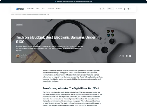
Overlay
Highlight your posts with an overlay header, merging imagery and text for a captivating introduction.
Column
Organize your content with a column header, offering a structured and clean presentation of your posts.
Full Width
Make a bold statement with a full-width header, utilizing the entire screen to grab your audience's attention.
Value-Adds
More Special Features for
More Sales
Take advantage of our theme's special tools to gain a competitive edge and increase sales.
Infinite Scroll
Keep visitors engaged longer with infinite scroll, seamlessly loading content for endless browsing.
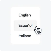
Language Selector
Expand your global reach with a language selector, making your site accessible to a worldwide audience.

Age Verifier
Ensure compliance and responsible browsing with an age verifier, gating content based on user age.
Sticky Header
Improve site navigation with a sticky header, keeping key links accessible as users scroll.
Black-to-Top Button
Enhance user experience with a back-to-top button, offering a quick return to the top with a single click.
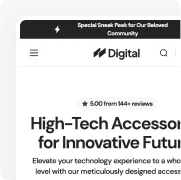
Announcement Bar
Drive attention to important messages with an announcement bar, displaying offers or updates at the top of your site.

One-of-a-Kind Support You Can Rely On
Receive a response within 15 minutes: any hour, every business day. Even during your trial, we're here whenever you need us. Choose the option that works best for you.

Live Chat Online •
Real-time help from our Support team
Submit Tickets
Request a Fix or Customization
Documentation
How-to guidance for theme setup and use

Customization Services by Theme Authors
Receive personalized theme updates straight from the professional team. Customize the design, request new features or tools.
Request an Offer
 New-Standard Theme
Optimize Your Store with a Unified Toolset
Boost sales with a feature-packed theme designed for eCommerce success.
Made by

Explore a world of possibilities for your eCommerce site with the exclusive collection of Shopify themes.
Visit Segment 
